Interior colour trends 2025: the hottest hues set to dominate our homes this year
Bring colour into your home with the hottest interior colour trends, from paint shades to soft furnishings and accessories

Tamara Kelly
Sign up to our free daily email for the latest royal and entertainment news, interesting opinion, expert advice on styling and beauty trends, and no-nonsense guides to the health and wellness questions you want answered.
You are now subscribed
Your newsletter sign-up was successful
Want to add more newsletters?
Planning to give your home a makeover in the coming months? Embracing the hottest interior colour trends of 2025 is a simple and effective way to enliven any space.
We've consulted with leading design experts to explore what shades they'll be using in the coming year when bringing the latest interior design trends to life. Everything from on-trend interior paint colours and furnishings, it seems many of the new interior colour trends are reflecting a growing desire for warmth, comfort, and connection with nature.
More and more people are craving spaces that feel nurturing and inviting. As a result, we are continuing to see a focus on grounding, earthy and natural tones. But for 2025 we're also seeing a shift towards richer, more saturated hues, to add personality to homes.
Article continues belowInterior Colour Trends 2025: how to use the hottest hues in your home
No matter your style, whether you prefer bold maximalist decor or the more hushed tones of quiet luxury, whether you're looking to incorporate a subtle refresh on this year's kitchen trends or a bold new look to overhaul, there's a colour trend for 2025 that's perfect for you.
"This year’s palette is all about comfort, warmth, and natural influences," says interiors designer Michelle Shakallis Johnson MA (RCA). "Whether through rich browns, sun-warmed ochres, or soft olive greens, 2025’s colours create a cocooning yet sophisticated atmosphere – perfect for modern living."
From calming earth tones that invoke a sense of tranquillity to bold shades that make a statement, this year's interior colour trends promise to transform any room in style.
1. Grounding shades of brown
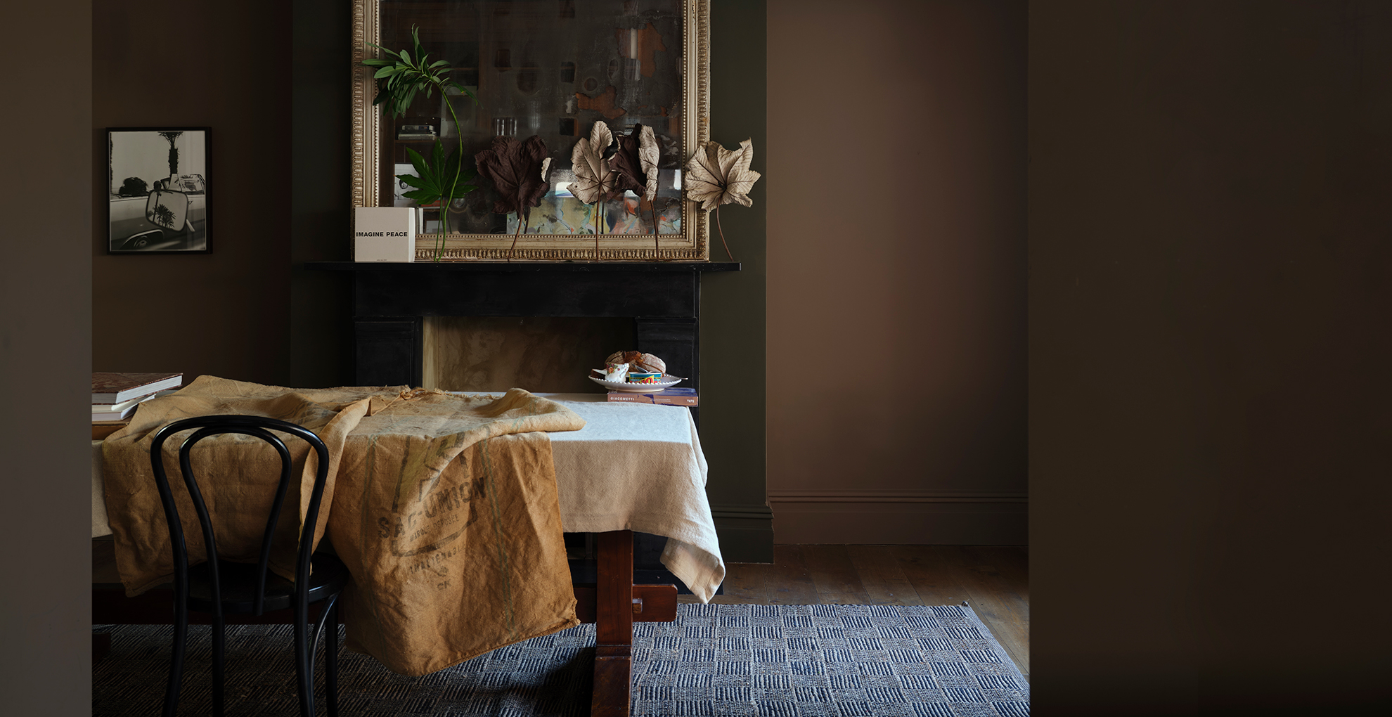
Such as this deliciously rich shade of Broccoli Brown by Farrow & Ball
Decorating with brown continues to dominate in 2025, spurred on by Pantone's Colour of the Year 2025 Mocha Mousse and the introduction of Farrow & Ball's new paint colours. “Warm, sophisticated browns are making a comeback, but with subtle undertones of red and mauve, adding a sense of luxury and depth,” says interior designer Michelle Shakallis Johnson.
Sign up to our free daily email for the latest royal and entertainment news, interesting opinion, expert advice on styling and beauty trends, and no-nonsense guides to the health and wellness questions you want answered.
“These colours evoke feelings of comfort and are easy to live with. They are a warm palette that delivers cocooning, soothing and restful schemes," she adds. "These hues work beautifully in living spaces, paired with velvet textures, dark woods, and soft metallics for an effortlessly elegant look.
For a bold statement, she suggests colour-drenching a room, painting the whole room including the woodwork in these dark, earthy shades.
If you’re worried a whole room in chocolate brown will look too much like a 70s-inspired decor, instead go for furniture, such as sofas or sideboards, in dark shades of brown.
After studying at the Royal College of Art. Michelle began her career as a knitwear designer for brands such as Whistles and Calvin Klein. In 2015, while renovating her dream home in Kent, Michelle developed a passion and inspiration for interiors. Michelle retrained and set up her own company in 2018. Michelle offers a design service on large-scale remodels, quick and simple makeovers or a simply choosing paint colours.
2. Plaster pink
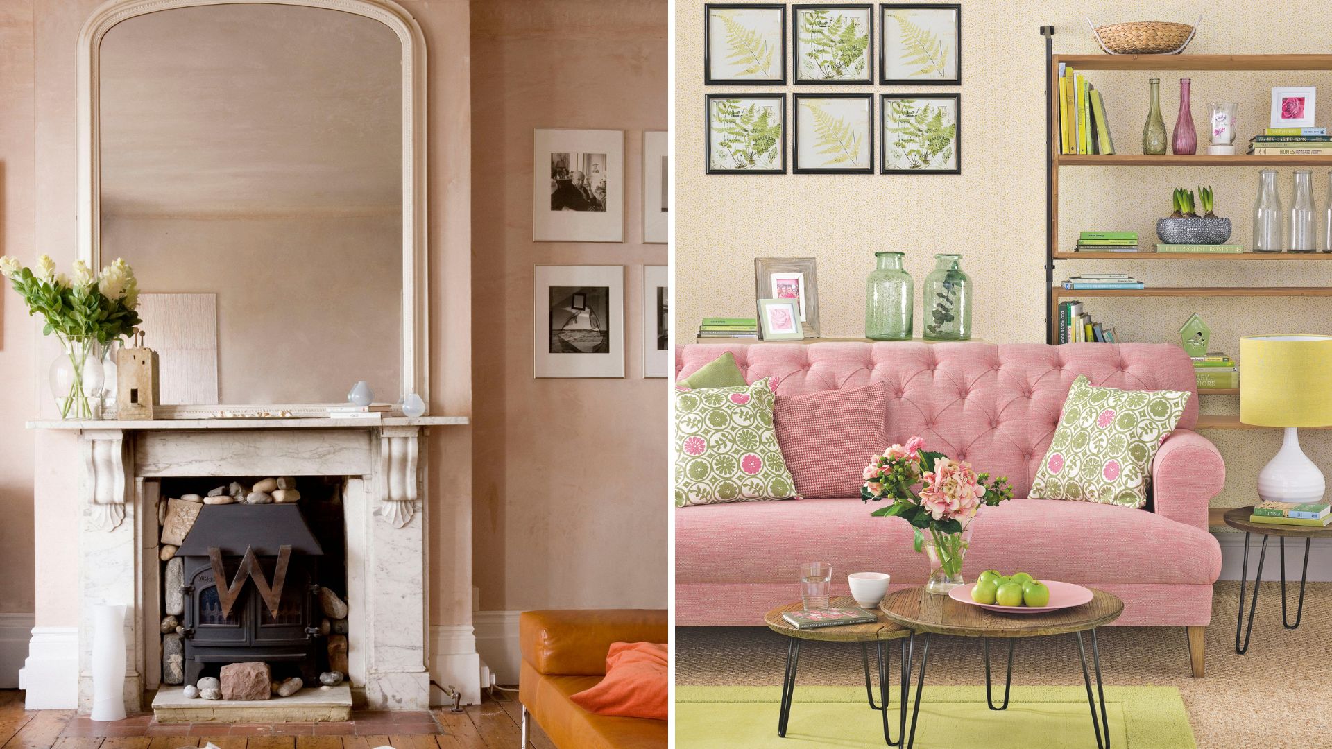
Pink is the new warm 'neutral' for walls and furniture choices
Soft plaster pink is having its moment in the interior spotlight. Calmer than its more vivacious sister – bubblegum Barbie pink – it offers the chance to create a calm haven in your home. Sweet Embrace, Dulux’s colour of the year for 2024, is still one such example of this on-trend warm pink shade.
Designer Matthew Williamson says this shade of pink is a great way to dip your toe into colour. “I love using a soft plaster pink on the walls at home, as it feels like a new neutral,” he says.“Warmer than grey and more interesting than beige, it adds a unique and different element to the space.”
While plaster pink paint colours and accessories make for a great neutral, Matthew suggests using darker, rich shades to bring your interiors alive. “I’d suggest investing in velvet cushions and printed bed throws in rich chocolate, cinnamon and burnt orange,” he advises. Imagine the shades of a beautiful sunset.
“I feel this palette will work well against the soft pink and add warmth to rooms such as the bedroom or lounge. It’s also a versatile combination that works all year round, not just for the colder months.”

Matthew Williamson is an award-winning, British interior designer known predominantly for his unique use of pattern and colour. Having begun his illustrious career in fashion under his namesake brand for over 20 years, Matthew has drawn on his decades of experience and pivoted seamlessly into the world of interior design. Alongside his growing design portfolio, Matthew has also launched a series of homeware collections in collaboration with John Lewis, Pooky, Roome London, Obeetee and more.
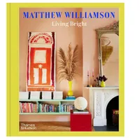
Living Bright: Fashioning Colourful Interiors by Matthew Williamson, £30 at Amazon
Matthew's inspirational book, published by Thames & Hudson, is a 'practical guide and a personal invitation from the king of colour to find your style and embrace the paint pot whether designing a castle or a cupboard.'
3. Uplifting 'sunshine' yellow
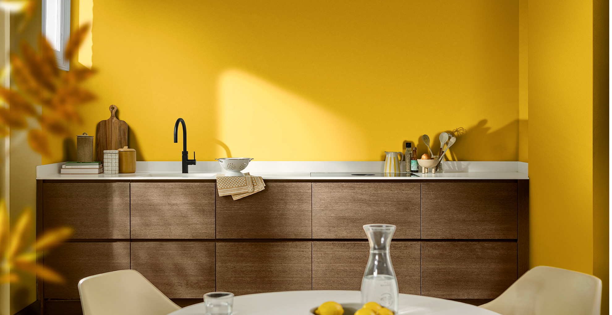
Dulux's Colour of the Year 2025 True Joy is sure to brighten up any room
This unapologetically bright shade of yellow is certainly not for the faint hearted. Named as the Dulux Colour of the Year 2025, 'True Joy' is set to be the bold new hue to enliven homes where a burst of colour is needed.
"Yellow is an incredibly versatile and warm hue that brings a cheerful energy to any space. It’s an inviting colour that evokes feelings of comfort and optimism, making it perfect for both contemporary and traditional interiors," says Shelley Cochrane, accessories buyer at Furniture Village.
"To style yellow in the home, consider pairing it with neutral tones like soft whites, beiges, or light greys to let the colour shine without overwhelming the room."
"For a more vibrant look, it can be complemented by earthy greens, muted blues, or soft pinks. Yellow works beautifully in kitchens, living rooms, and bedrooms, where it can enhance the natural light. For a playful yet refined touch, try using it on accent walls, cushions, or light fixtures. It’s an ideal colour for creating a fresh, uplifting atmosphere while maintaining a sense of sophistication."
4. Dark olive green
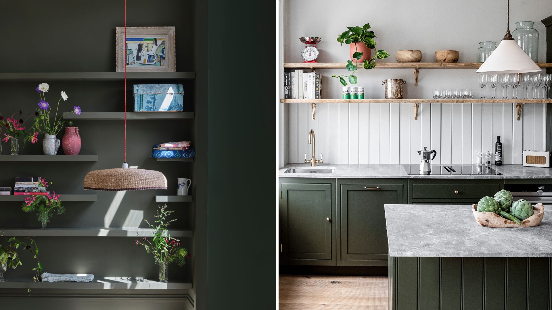
On the left is the stunning new sahde by Farrow & Ball called Reduced Green
Move over sage green and forest green, there's a brooding, dark olive green on the block. "The world of interiors is getting excited for warm earthy colours,” says Ben Thomson, colour expert at Promain Paints. “The trend of green is set to continue with an introduction of deeper tones and in particular olive green.”
"Green remains a favourite, but the cool sages of previous years are evolving into warmer olive tones, often with a hint of yellow for added vibrancy," says Michelle. "These shades bring a relaxed, grounding feel – perfect for kitchens, bedrooms, and natural wood pairings."
This darker hue is a moodier, more sensual twist on the previous green colour trends, so would suit living rooms and bedrooms, however, don’t dismiss the kitchen either. Not only is olive green a good paint colour idea for a kitchen, but it also works well for kitchen cabinets – proven by the Harvey Jones kitchen shown above.
5. Intense red
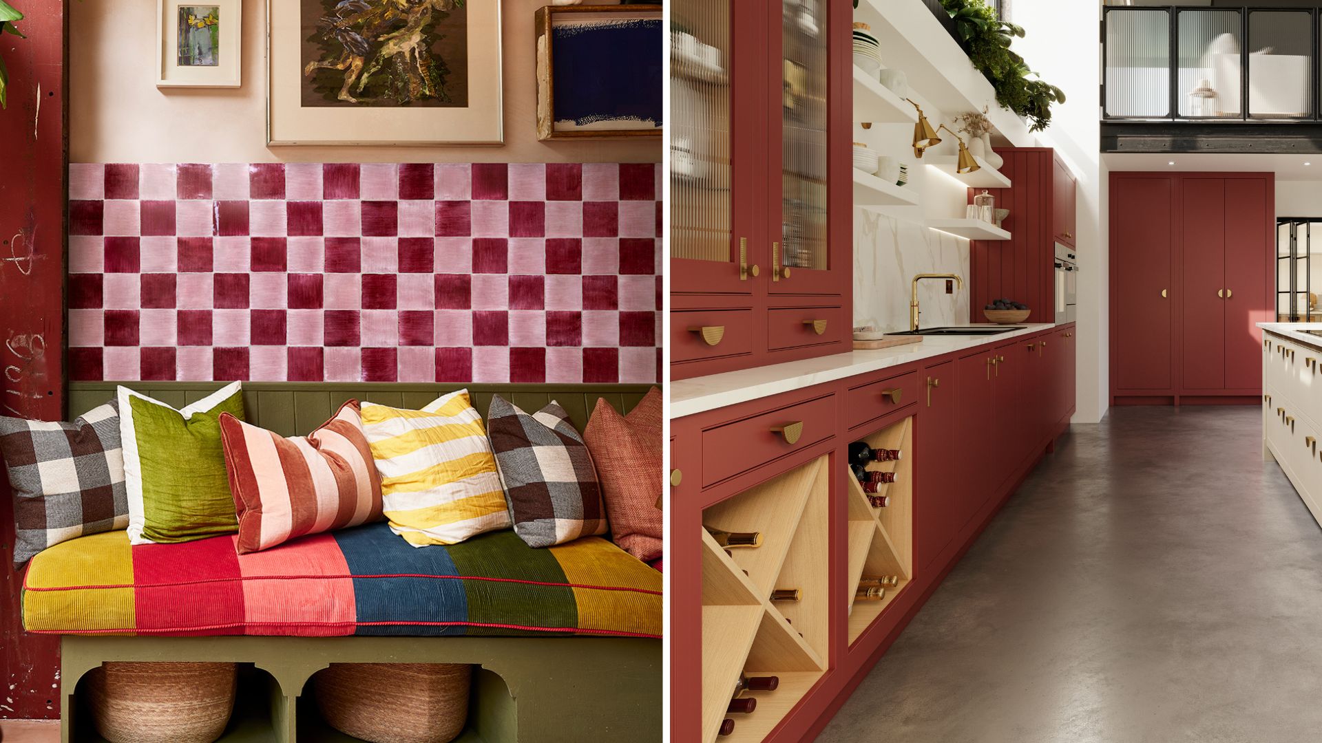
Scarlet red shades dominated the catwalk this season, prompting us all to search how to wear red, and it’s proving to be popular for interiors as well for 2025. 'Cherry Red' has been named one of the biggest colour trends of the Pinterest Predicts report.
Paint and interior experts alike cannot get enough of using the unexpected red theory for adding flashes of colour into the home. However, if the shade feels too intense to use widely throughout, do not fear because a little goes a long way with working with such a bright primary colour. Introducing small touches of red to a room adds vibrancy and energises the scheme.
“Red looks beautiful as an accent in the deep blue living rooms we’ve embraced, as a flash of cosy colour on large pieces of furniture in the country to farmhouse looks, or as a sexy colour pop in a contemporary sixties space,” says colour enthusiast Annie Sloan.
While it’s a super modern colour, it can be quite overwhelming for those who are colour-averse, we advise using it sparingly to begin with. The trick is to keep it subtle so this bold attention-grabbing colour doesn’t end up dominating the space.
Try using it in unexpected places such as painting the stair risers crimson or placing one red chair around your kitchen table.“Ease yourself in by painting just one piece of furniture and bask in the great warmth, dynamism, and personality it brings to a space," suggests Annie.
"Then, once you’re warmed up, take the plunge and splash around more liberally. This is a fabulous choice in social or active spaces – especially hallway paint colours and dining rooms.”
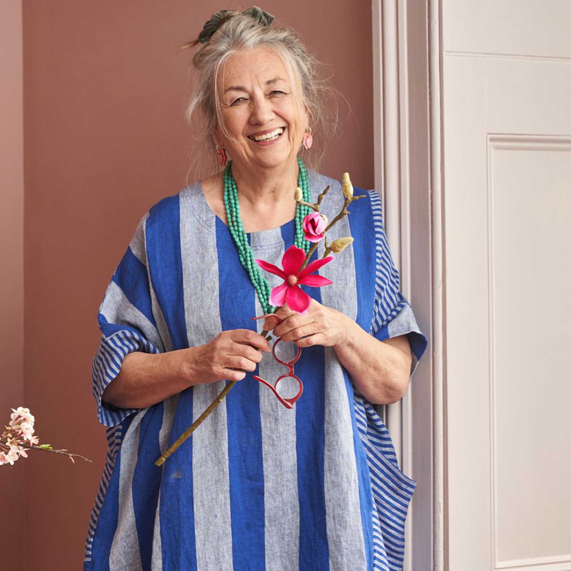
Annie Sloan, CBE, invented her revolutionary furniture paint, Chalk Paint™, in 1990 and hasn’t stopped refining and improving her formula since. She is widely considered one of the world’s leading authorities in paint, colour and style. In 2023, Annie was appointed Commander of the Order of the British Empire (CBE) for services to interior design.
6. Soft butter yellow

While there's a place for sunshine bright yellow in people's homes in 2025, there's also a demand for softer, less overwhelming shades of the same colour. Therefore, 'butter yellow' is set to be another significant interior colour trend for this year.
"Instead of bold sunshine tones, 2025’s yellow is soft, buttery, and inviting," says Michelle. "This muted pastel shade brings a sense of lightness, working beautifully in modern country schemes."
From paint colours to flooring and even fixtures and fittings – as you can see above from the characterful butter yellow log burner from Direct Stoves, there are so many ways to introduce this sumptuous shade in your home. It's even been named as the KitchenAid Colour of the Year 2025 to welcome it into kitchens.
"Butter yellow carries the bright, uplifting qualities of yellow but with a softer, more subtle presence," says Lena Gierasinksa, head of product and displays at Barker and Stonehouse. "In colour psychology, yellow is linked to optimism and clarity, but when toned down to a butter-like shade, it promotes calm and emotional warmth.
"It’s often associated with nurturing and comfort, making it ideal for creating a peaceful environment. This colour can encourage positivity, reduce stress, and even foster creativity so it’s no surprise that people like to use it in the home.
In spaces like bedrooms or living rooms, butter yellow can evoke a sense of tranquillity while still maintaining a light and joyful atmosphere. It’s a wonderful choice for areas where you want to inspire a sense of ease and connection, without overwhelming the senses."
7. Terracotta
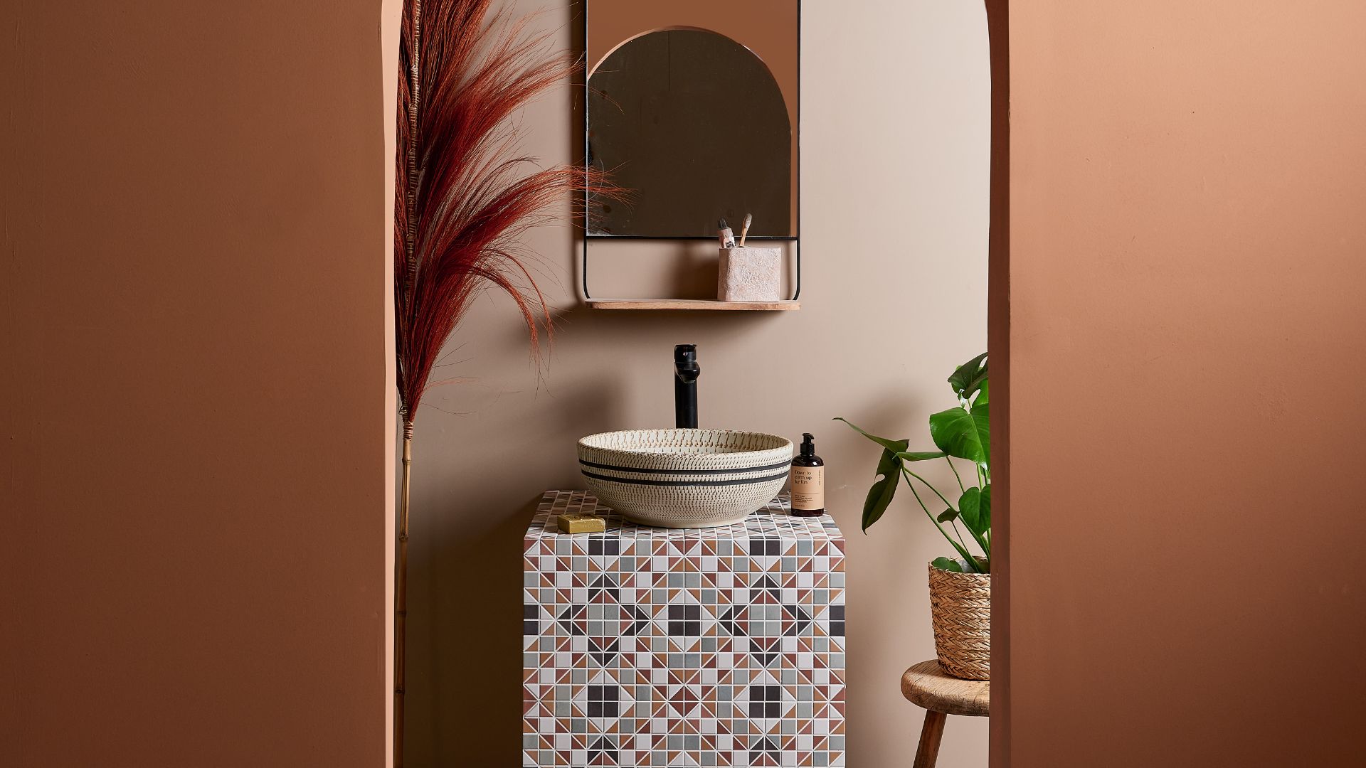
Terracotta is a darker pigment than plaster pink, but it has a softness to it that you can’t get with other darker on-trend shades.
"The influence of nature continues, with sun-baked terracottas, earthy ochres, and delicate clay pinks bringing warmth to interiors," says Michelle. "These colours feel organic and timeless, working beautifully in textured walls, soft furnishings, and statement pieces. Expect to see them in Mediterranean-inspired schemes and modern rustic spaces."
“It is about adding warmth and cocooning within the home for this coming season," says Grazziella Wilson, head of creative at Ca’ Pietra. "Terracotta colours are grounding and have a wonderfully calming effect on a space.”
This shade also pairs well with other interior colour trends of 2025 such as olive green, dark blue or biscuit. While it is a statement shade, there are ways of introducing it into your home in more subtle ways, says Grazziela.
“One room where this shade is proving to be popular is in bathrooms, so look to choose a patterned tile that has terracotta tones running throughout it,” she says. “If you do find that this colour suits your space, you can look to then match the colour from your tiles onto your wall.”
8. Comforting biscuit tones
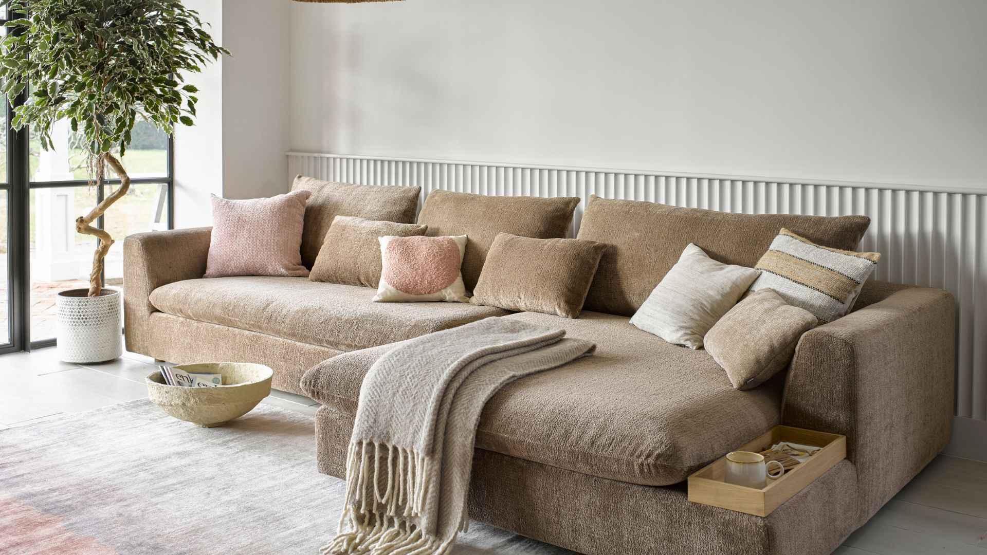
With warm neutrals remaining popular in place of cool shades of grey, this year continues to see a fondness for buttery biscuit beige tones. Less overwhelming than bright red, but with the versatility of grey, biscuit shades add warmth to any interior.
This soft shade is a great accent to use against other on-trend shades such as dark brown or olive green, and it even works well paired with the best white paint colours, offering a soothing sanctuary.
It's a beige that’s anything but boring and this is one colour trend that extends beyond the shade.
“The need for a natural touch will also be reflected in the continuing shift toward more sustainable furnishings and decor like recycled upholstery, organic materials and of course, thrifted pieces,” says Francesca. Making the act of buying second hand furniture more popular than ever
Using rattan accessories, such as lampshades, or hanging natural fabrics on the wall are easy ways to incorporate this shade, as well as give a nod to comforting textures, one of the biggest design trends of 2024.
FAQs
What is the decorating colour for 2025?
While grey, greens and millennial pink have ruled the interior colour roost for years, richer, earthier tones also look set to be all the rage for the coming year.
"In 2025, interiors are embracing warmer, earthier tones, creating inviting and grounded spaces,” says Michelle Shakallis Johnson MA (RCA). “This year’s colour trends move away from cool neutrals, instead favouring rich browns, soft terracottas, and muted greens – all infused with depth and warmth.”
“I think unusual colour combinations will become more commonplace as people strive to create unique homes,” says designer Matthew Williamson. “Colour-drenched walls can be the single most effective and affordable way to transform and elevate a space.”
Is grey out of style for 2025?
It seems the resounding answer to the grey question is yes, decorating with grey is no longer as popular as it was a few years back.
“Making way for more characterful tones, I imagine we will see less neutrals such as white, beige and grey being used which can sometimes feel flat and perhaps a little bland,” says Matthew.
Instead of using these cooler tones, Matthew sees warmer colours such as pink, tan, clay, terracotta and peach becoming more popular for interior decoration. Saying: “They instantly warm up and modernise a space, whether used individually or combined in one scheme."
With over 25 years’ experience in journalism, Jayne has written about a variety of subjects. She spent the start of her career within the world of film, interviewing Hollywood stars, attending premieres and lusting after red carpet outfits, and then moved into fashion, launching websites for big magazines such as Look, Woman’s Own and Wedding and working with top fashion brands such as Westfield, LK Bennett and Hunter.
Career highlights include dressing up as Kylie (in gold hot pants!) for a national newspaper and working on big fashion events alongside Giles Deacon, Henry Holland and Naomi Campbell.
- Tamara KellyLifestyle Editor
