How to use the Dulux Colour of the Year 2024 'Sweet Embrace' in your home
Explore the newly announced Dulux Colour of the Year 2024, a timeless neutral to welcome serenity to our homes
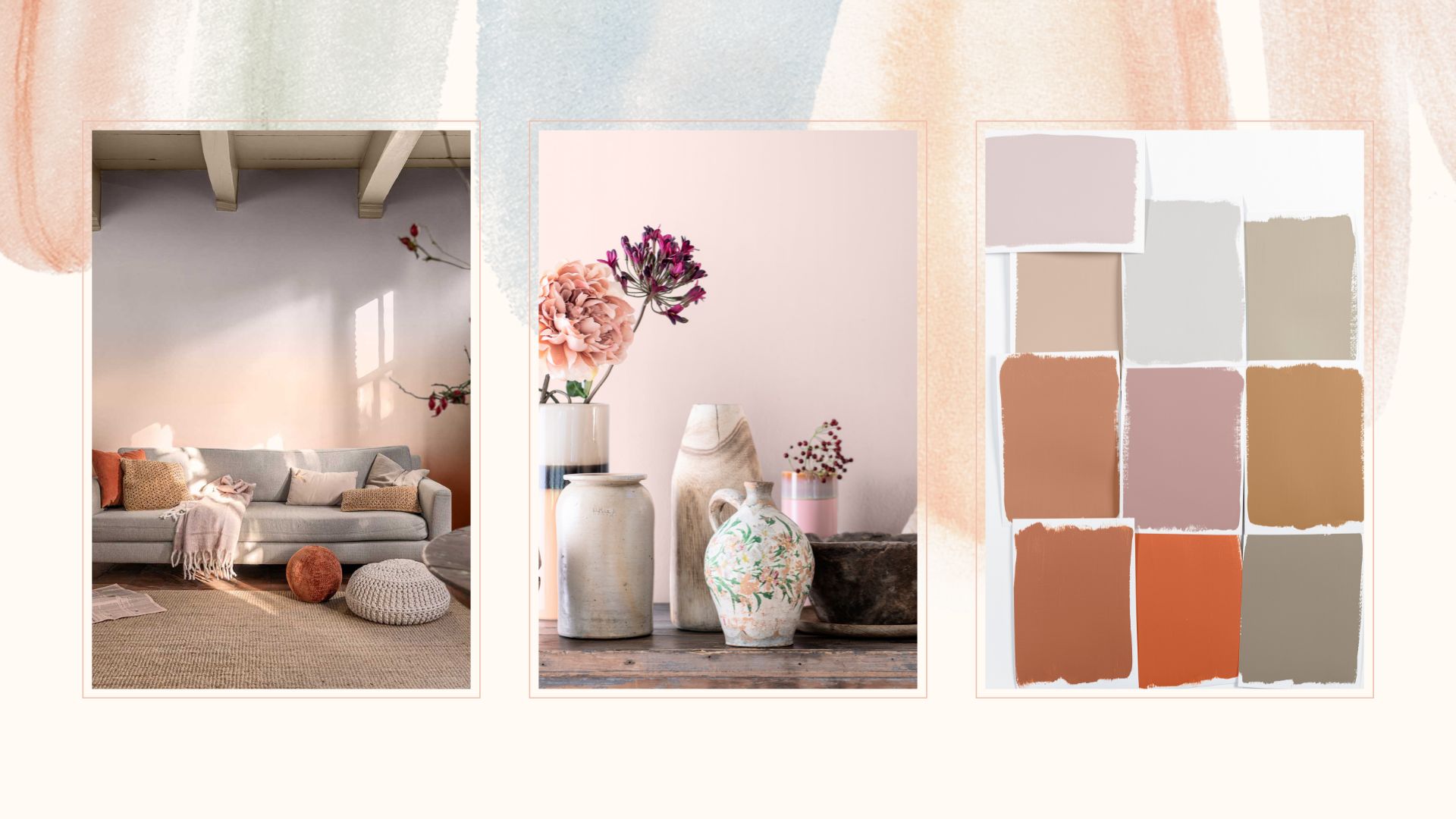

The Dulux Colour of the Year 2024 has just been announced to the world – a beautiful colour called 'Sweet Embrace', a delicately soft pink that feels like a timeless warm neutral.
Unlike last year's Dulux Colour of the Year 2023, golden green 'Wild Wonder', the shade of choice for this year is much more of a warm neutral with a subtle hint of pink to welcome a comforting warmth.
"This colour is a beautifully soft, cool pink," explains Dulux's creative director Marianne Shillingford, speaking exclusively to woman&home to reveal the new interior paint colour trend. "It has a very soft lavender, a cooler grey hint to it very much like porcelain."
“What is so wonderful about 'Sweet Embrace' is its soothing quality. Like a whisper of reassurance in a moment of stress, it has a visual softness that calms the senses and creates an atmosphere of serenity."
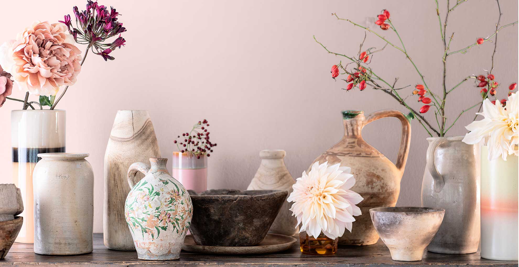
Enhancing our sense of well-being within our homes has become more significant than ever, as recognised by recent interior design trends, to create a safe, calming sanctuary away from the fast-paced world outside.
“We’re all running non-stop these days, so it’s important that our homes provide us a raft in the storm, where we feel safe to take time out from facing our toughest challenges," says Marianna.
Sweet Embrace: How to introduce the Dulux colour of the year 2024 into your home
A warm neutral, such as Sweet Embrace, is ideal for creating a canvas of calming colour in any room to aid a feeling of contented restfulness. As Marianna explains: "A shade as subtle and versatile as 'Sweet Embrace' encourages us to get quietly creative and fashion spaces that allow us to be our best, most authentic selves – and vitally, feel completely at home.”
Sign up to our free daily email for the latest royal and entertainment news, interesting opinion, expert advice on styling and beauty trends, and no-nonsense guides to the health and wellness questions you want answered.
Marianna adds: “While being a beautiful standalone colour, it’s a hue that perfectly combines with so many other shades making it a cheerleader in colour form. It’s the perfect modern neutral that you can use with confidence, knowing it will unite each element from furnishings to artwork whilst creating a gently uplifting atmosphere."
Discover inspiring ways to use this soft shade in your home.
1. Paint the windows to catch the light
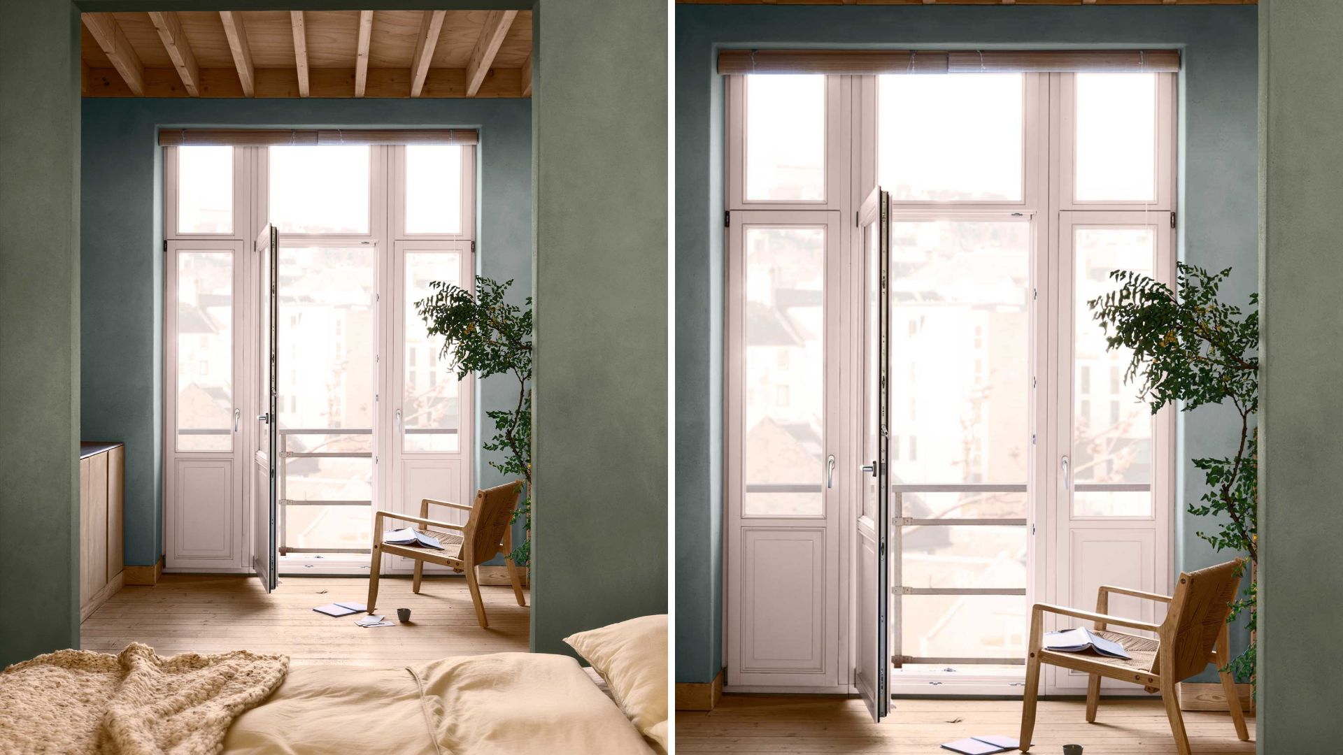
This colour has metameric qualities, meaning it changes the depth of the pink undertones as different light strengths hit it throughout the day, altering the overall aesthetic. In the early morning light, it appears crisper, yet becomes a more blush pink during the brightness of midday, and increasingly violet in the evening.
And what better way to capture those lighting-changing qualities than by painting the window frames?
Using this soft pink on windows invites a gentle glow into the room as the light enters the room. "Sweet embrace is amazing in windows as an alternative to white," says Marianne, "As the light comes through the soft pink bathes the room, it takes on the colour of the light that hits it."
"People often don't realise that light bounces off colour and the colour it bounces off infuses the room with a sense of that colour." This means soft pink will project into the room beyond. This pink paint colour is especially perfect for a north-facing home because it will add warmth to any natural light that filters through the windows.
2. Colour drench for a cohesive scheme
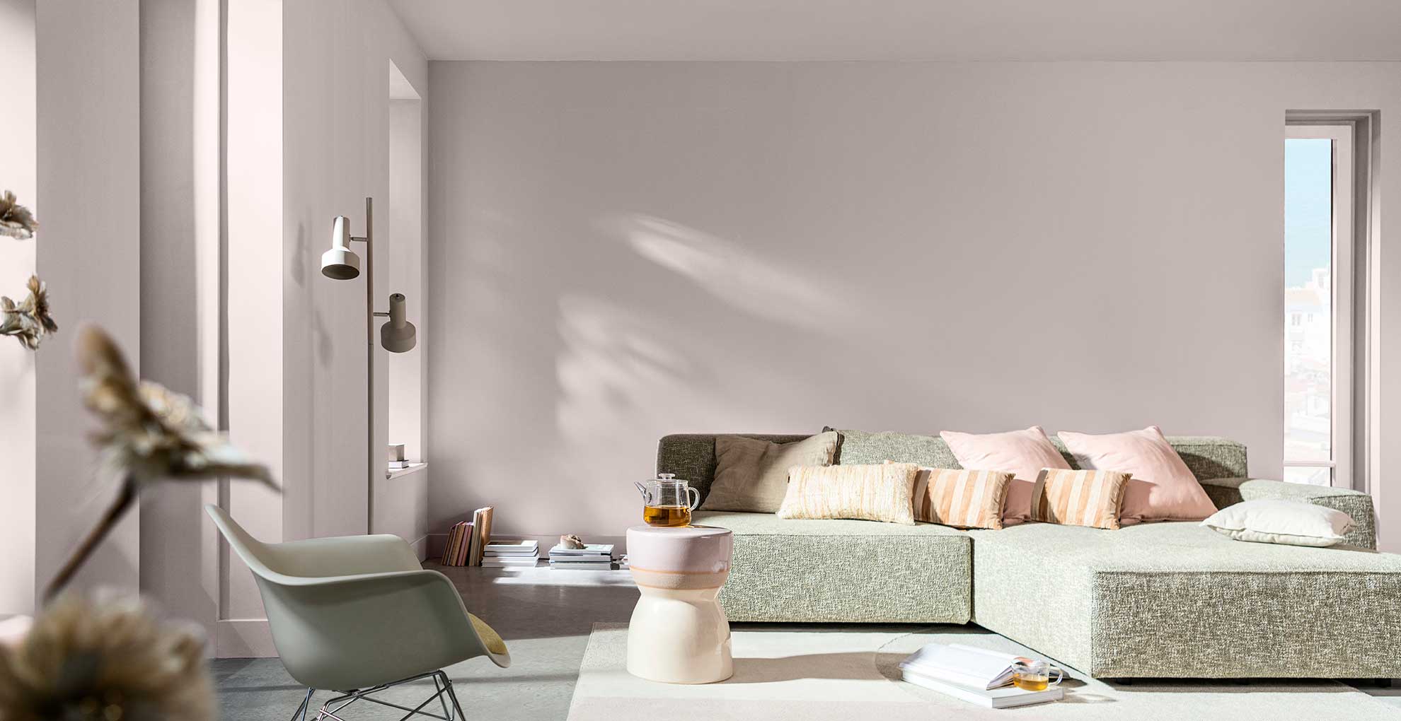
This beautifully versatile shade is an easy option to colour-drench the entire room. Colour drenching, as the name suggests, is the action of literally drenching the whole room in one chosen shade to create a sense of calm cohesion.
This means painting all surfaces within the room, beyond the four walls, in one colour – so painting skirting boards, ceilings and painting doors the same colour.
This cohesive use of colour has become one of the most popular ways to embrace the latest paint colour trends in recent years. This delicate shade would be ideal for creating the backdrop for a chic Parisian style decor.
3. Embrace on-trend ombre
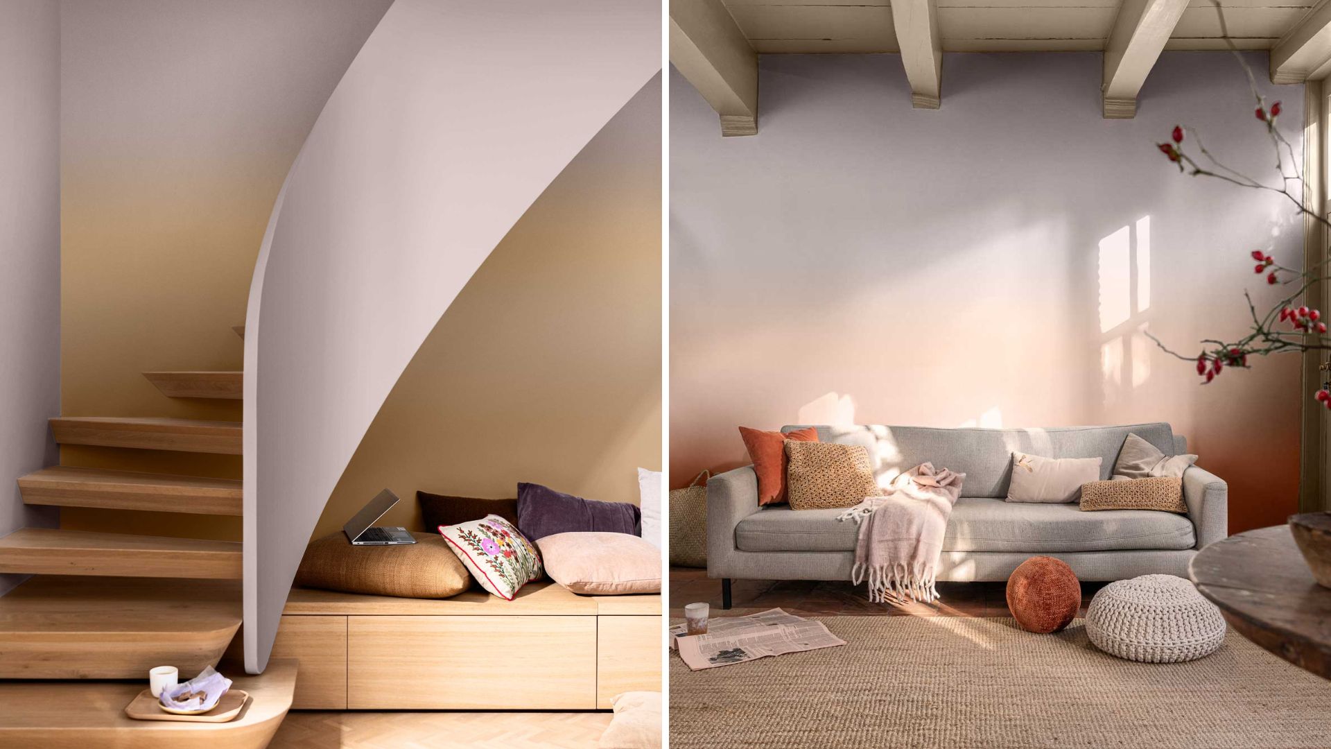
Marianne tells us that ombre is making a comeback in 2024, and quite honestly anything she says about decorating is a trend to watch closely – because her job is to forecast how we decorate our homes.
The creative team at Dulux have made it look easy to embrace this on-trend paint technique using the new neutral as it seamlessly blends into another soft shade to create a deliciously subtle sunset effect.
A graduation of colour is a clever way to make a room look bigger with paint, with the colours appearing to stretch the walls and create extra height.
4. Use as an alternative to white
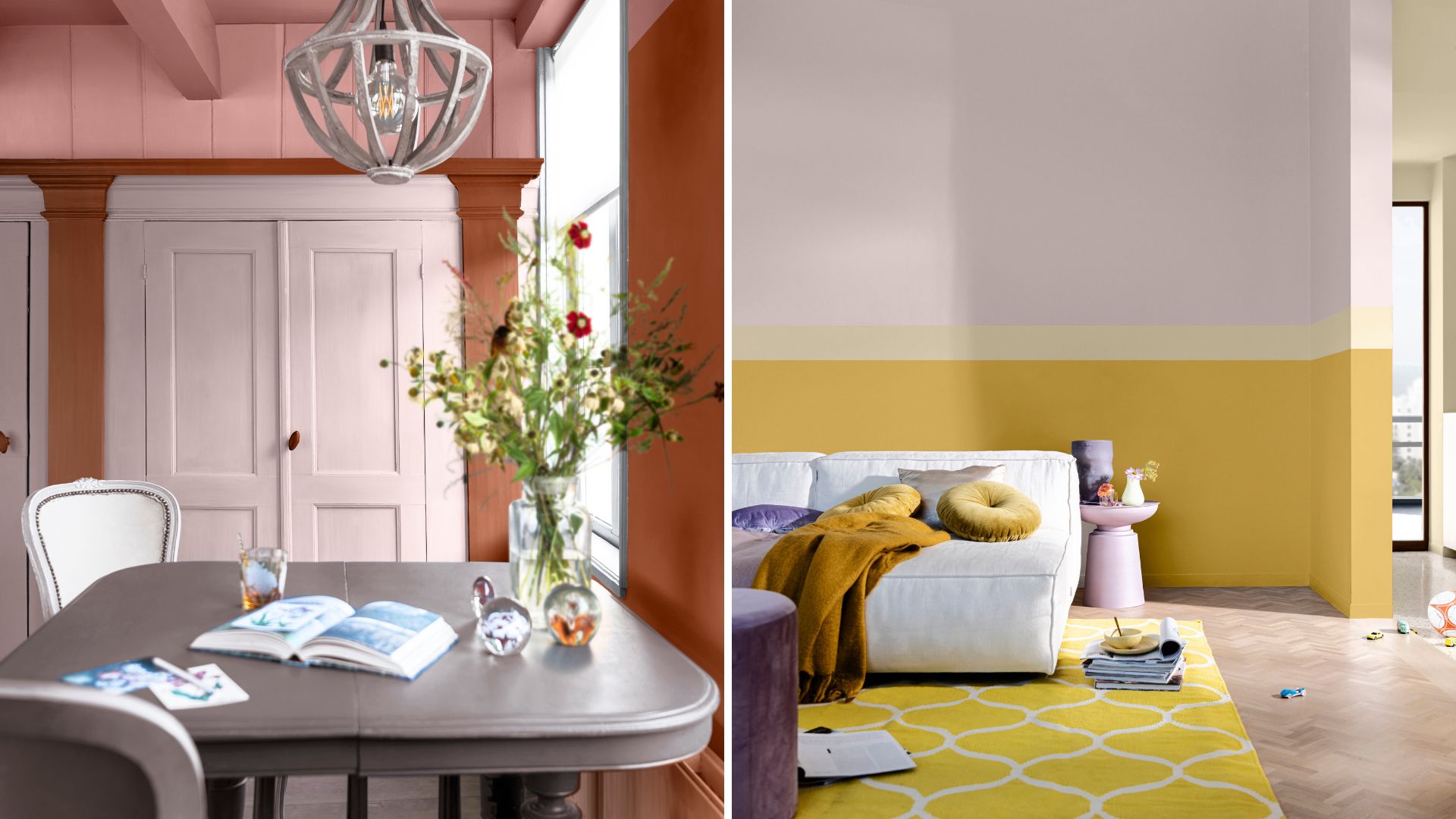
As we've discovered for the recent trend of painting skirting boards the same colour as walls there are no rules when it comes to painting woodwork. We suggest using 'Sweet Embrace' instead of the best white paints to as a warmer neutral to your overall decorating scheme.
That's not to say you can't also rethink white walls, especially if you are using warmer accent tones within your palette. As perfectly demonstrated by the creative team at Dulux who have chosen to replace white on the walls with a punchy shade of ochre above.
What is the Dulux Colour of the Year?
"The phenomenon of Dulux Color of the Year, spurred on by Pantone's Color of the Year, is focused on interiors and how we use colour," continues Marianne.
"It has become a mark on the calendar for designers and those who love interiors. It's a chance for us to share with the world what we know about colour and how colour can transform spaces and help you feel better, giving you what you want and what you need from your home."
According to the colour experts at Dulux, what our homes need in 2024 is a "gentle and soothing energy that wraps around you like an ‘arm around the shoulder’. A subtle yet diverse shade that delivers a stable, positive foundation to any space, and can be used in combination with a host of other hues to create a haven of tranquillity."

Tamara is a highly experienced homes and interiors journalist with a career spanning over 22 years. Now the Lifestyle Editor of womanandhome.com, she previously spent 18 years working with the style teams at Country Homes & Interiors and Ideal Home. With these award-winning interior teams, she gained a wealth of knowledge and honed her skills and passion for styling and writing about every aspect of lifestyle and interiors.
A true homes and interiors expert, Tamara has been an ambassador for leading interior brands on multiple occasions, including appearing on Matalan’s The Show and presenting at top interior trend forecasting events such as the Autumn Fair and Spring Fair.