How to use Pantone's Color of the Year 2023 in your home, according to interior design experts
Delve into the recently announced Pantone Color of the Year 2023, Viva Magenta. We break down how to use this trending hybrid tone in your home...
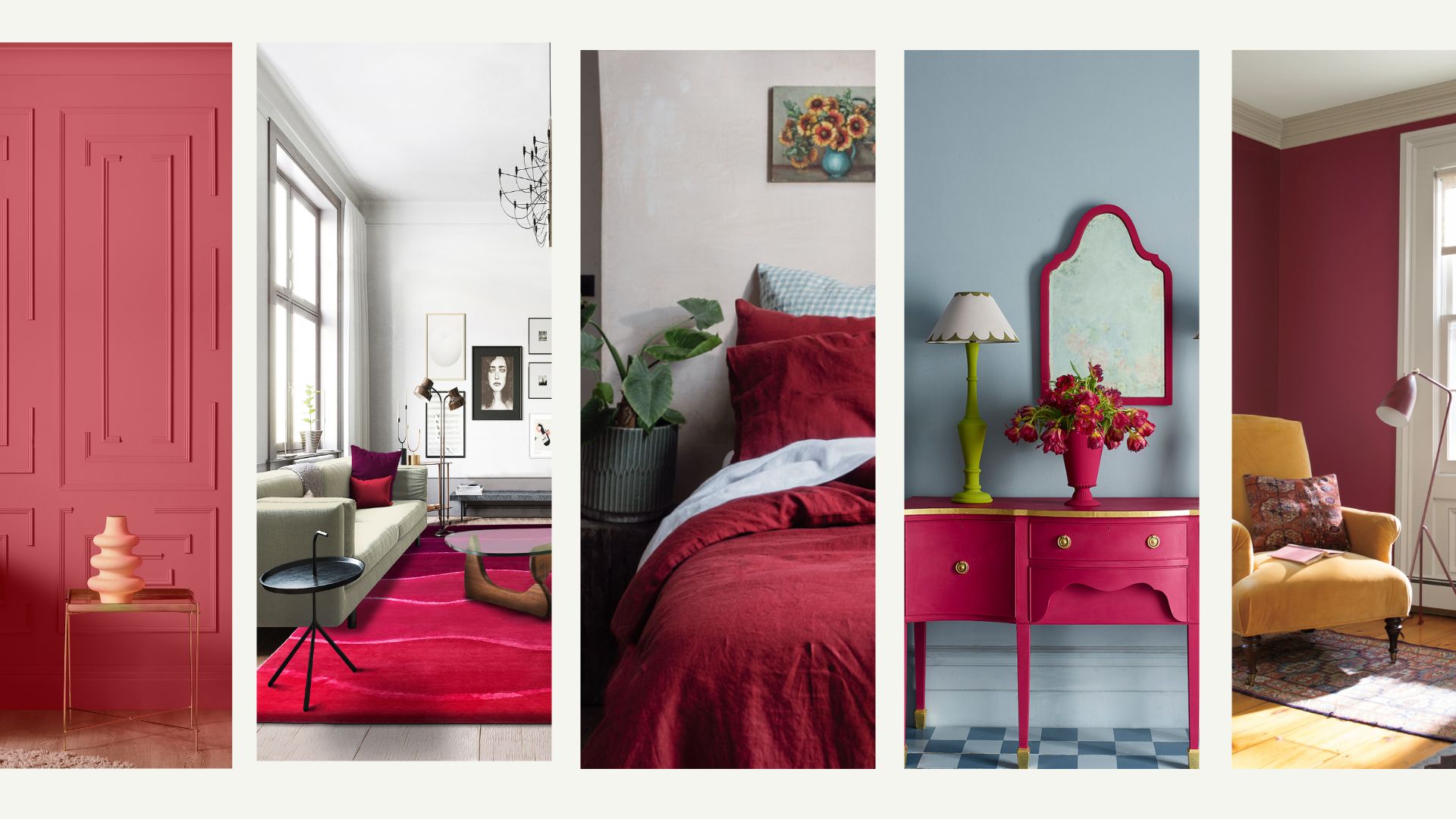

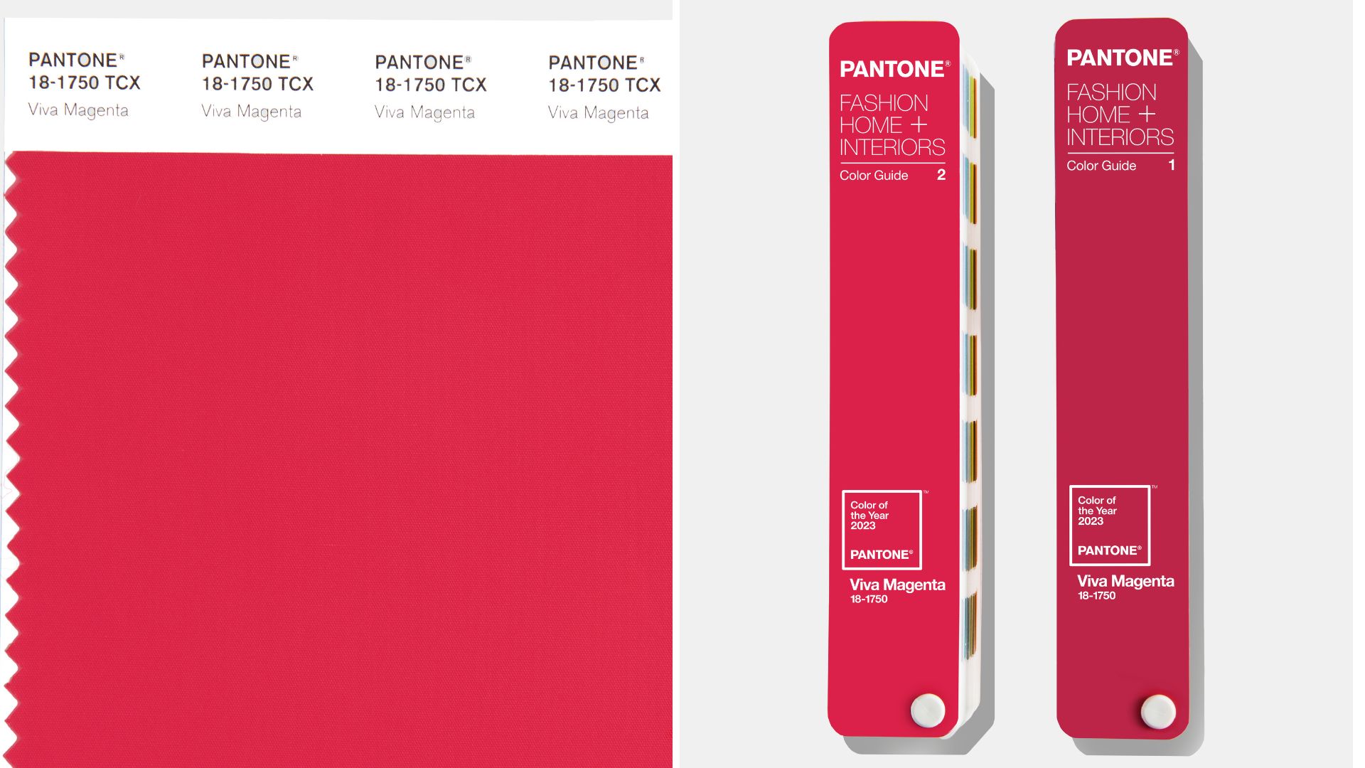
Every year the world of design waits with bated breath for the announcement of Pantone's influential Color of the Year to inspire interior design. We now know that the Pantone Color of the Year 2023 is...drum roll please, Pantone 18-1750 Viva Magenta.
"Powerful and empowering, it is an animated red that encourages experimentation and self-expression without restraint, " says the team at Pantone. "Brave and fearless, Viva Magenta is a pulsating color whose exuberance promotes optimism and joy."
The vibrant shade may not be for everyone's initial liking for their homes, but we're already seeing how variations on the hybrid red and pink color can translate for all interior tastes.
Red is such a multifaceted shade, one that can go from deep crimson to softer almost pink shades. It's the richer scale that has become a leader in interior paint color trends in 2023 along with one of the best kitchen paint colors and even one of the best hallway paint colors.
Below we explore how you can use this statement shade in your home to create an uplifting and rejuvenated decor for the year ahead.
How to integrate Pantone Color of the Year 2023, Viva Magenta, into your home
Recent interior design trends show that two clear, polarizing trends are emerging: Pared-back minimalism or full-on maximalism. Pantone 18-1750 Viva Magenta is a nuanced crimson red tone that suits those who want to make more of an expression with their interior choices, though you can add in some subtle references to it if you prefer a minimalist style. The brand describes the color as: "Assertive but not aggressive," bolder than the Pantone color of the year 2022 Peri Peri but not a color to be fearful of.
In fact like the best pink paint colors, this shade of carmine red presents a perfect balance between warm and cool, making it the ideal accent color for pretty much any color palette.
Sign up to our free daily email for the latest royal and entertainment news, interesting opinion, expert advice on styling and beauty trends, and no-nonsense guides to the health and wellness questions you want answered.
So will 2023 be the year you welcome this hot pink-cum-red into your home decor Whether on the walls, via a decorative wallpaper, or simply with accessories we explore the inspiring ways to use Pantone's Color of the Year 2023 in any room in your home.
1. Refresh a bedroom with new bedding
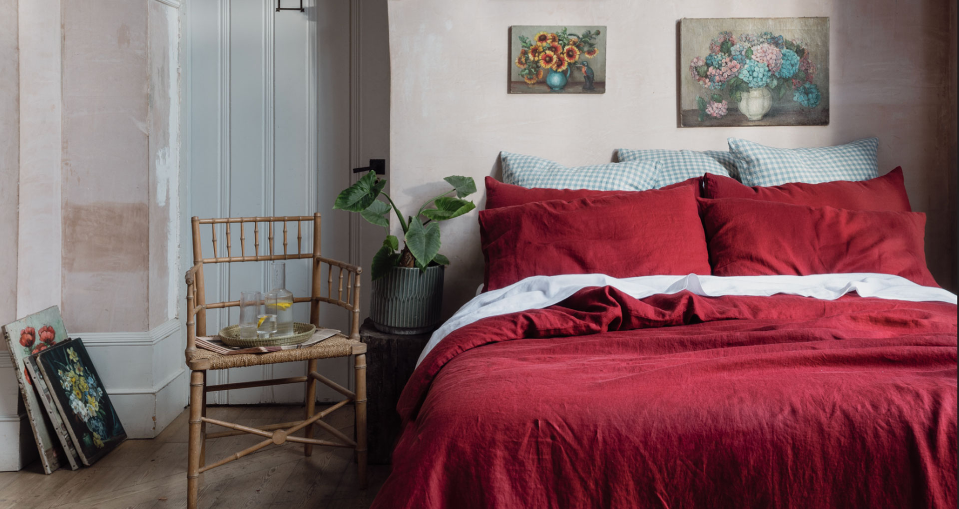
A change of bedding is one of the easiest, yet most effective ways to transform the feel of a bedroom space – far easier than having to repaint with one of the best bedroom paint colors. Choosing a rich shade of warming red is ideal if you're looking to introduce elements of Viva Magenta in your home.
Opting for sheets inspired by Pantone's vibrant tone is a great way to enliven a tired-looking bedroom decor in an instant. The beauty of this firey color is that it pairs perfectly with nearly all colors, providing a warm accent to enhance neutrals, grays, greens, and even darker brooding shades of navy blue.
2. Welcome a splash of paint
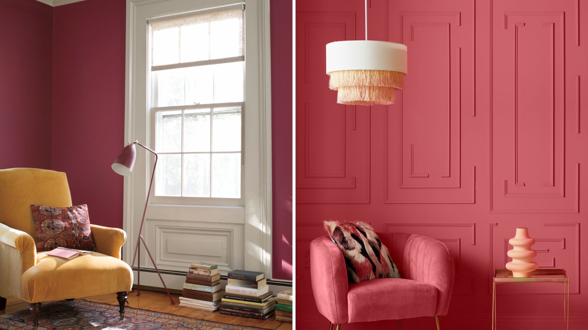
Benjamin Moore's Cranberry Cocktail and Graham & Brown's Vixen Paint
A splash of paint is an obvious way to instantly perk up any room in the home, especially in a shade as captivating as that of Viva Magenta. For those not afraid to envelop the room in richness there's the option to color drench all walls and trims, while for those who are looking more for a flash of color there's the trusty feature wall to command attention.
“It is easy to be put off using a bright color like this in the home, however, we think this is easily translatable into a homey hue," says James Greenwood, brand and interiors expert at Graham & Brown. "Our fearless Vixen paint is the perfect melding of a rich red with pinkish undertones. This stunning color looks playful in a brighter light, or sophisticated in a smaller cozy space.” Warming colors are renowned for having to ability to instantly make a home feel cozy and embracing, like a warm hug.
"This warming color can be worked into any room, whether it is in the furniture, window dressings, or of course, the walls" adds Paula Taylor, a trend specialist at Graham & Brown.
3. Introduce a hit of color with a rug
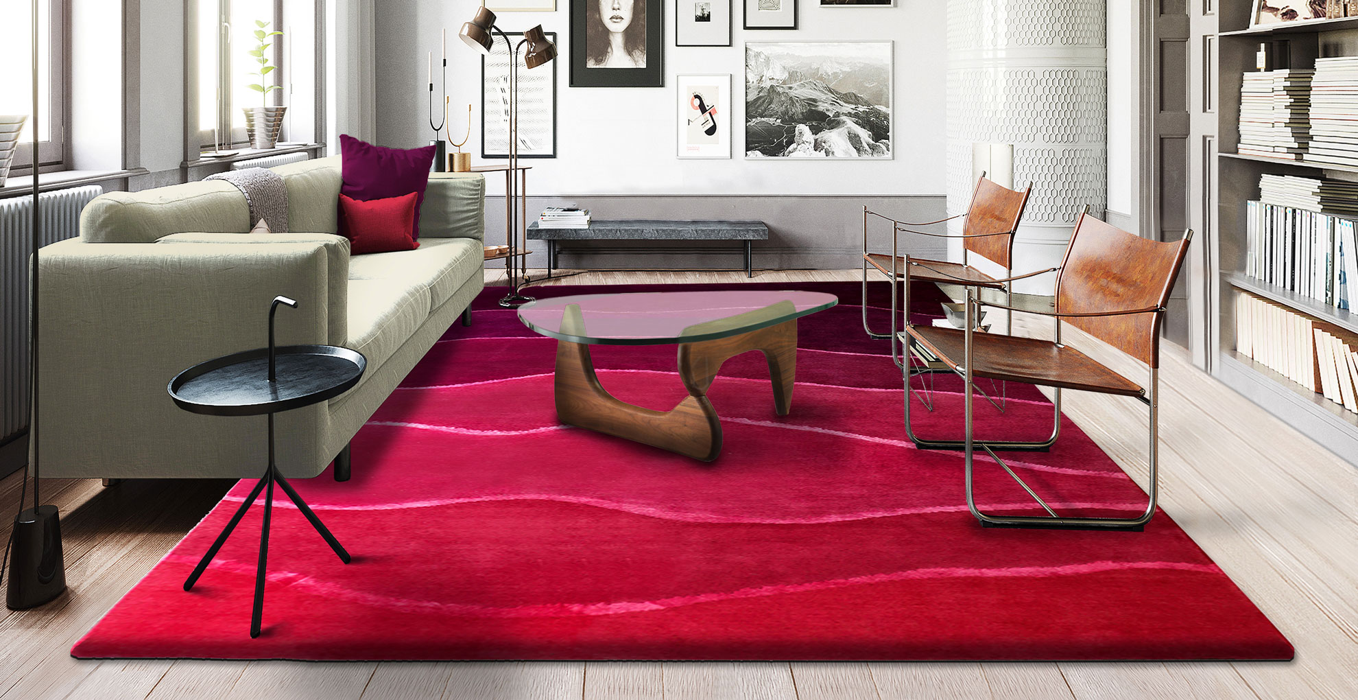
Rugs are the ideal way to add pattern or color to any room without having to change the surrounding decor. Using a rug in a shade inspired by Vivid Magenta, like this striking Landscape red Rug by Sonya Winner, adds the wow factor of the shade without having to paint or wallpaper the walls or commit to an expensive carpet that might not last given that it's a fashion color – not a timeless classic.
"Pantone’s decision to pick Viva Magenta as its color of the year, really captures how homeowners are becoming a lot more experimental with color," explains Daniel Prendergast, interiors expert at The Rug Seller.
“There has been a lot of uncertainty over the past few years, but people are pushing back against this by bringing brightness, positivity, and energy into their homes through their color choices, moving away from an entirely neutral color palette and choosing shades that bring them joy. It’s a really versatile shade that can be used loud and proud as a bold pop of color, or toned down with pattern and complimentary tones."
4. Hang new artwork
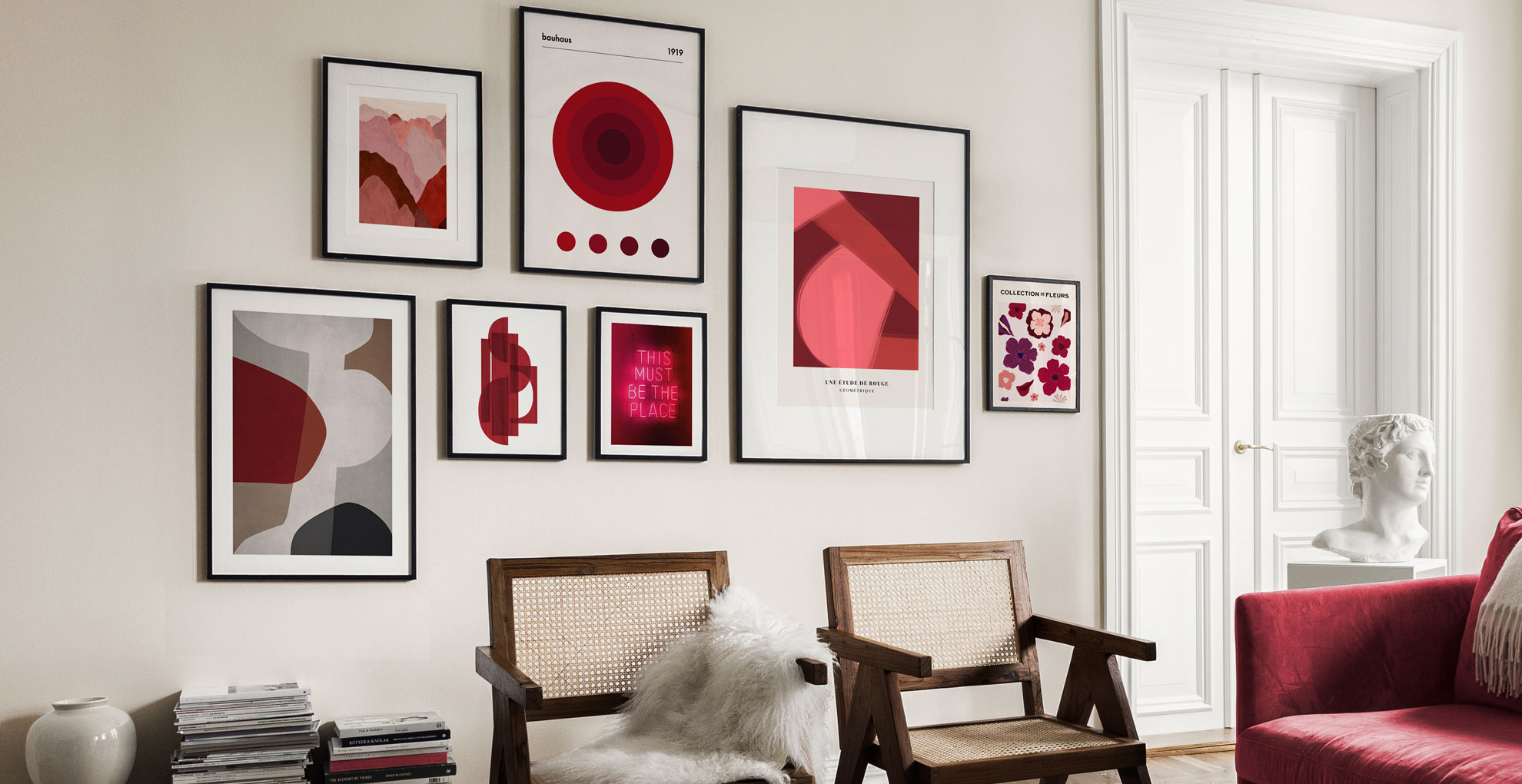
Hanging bold new artwork is a savvy way to add color to walls without having to change the decorating scheme. The best white paint color on walls can play the perfect blank canvas for a pop of on-trend color thanks to a statement piece of artwork.
"Viva Magenta encompasses the sense of playful optimism and self-expression that we see being a big trend for the coming year," says Annica Wallin, executive creative director, at Desenio. "This animated, crimson red is both exciting but comforting, and we hope it will inspire everyone to use their own creative license to inject color and joy into their home through our colorful art prints.”
5. Add accent soft furnishings
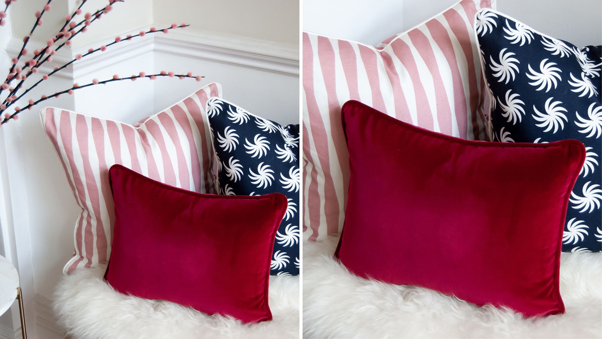
Never underestimate the power of adding a new accent color to any living space via soft furnishings, whether a few scatter cushions on a sofa or a luxurious throw draped across a bed the addition of simple accessories can be very impactful – and affordable.
Cushions in Viva Magenta-inspired colors, like this Cranberry velvet cushion by Sweetpea & Willow, can enliven a steadfast neutral sofa in an instant and take the whole decorating scheme in a new direction, no matter your living paint color. "While you may not plan to go all-out with Viva Magenta in your interior, it acts as an excellent accent shade bringing an exciting splash of color to more understated schemes," says Wayfair's resident style advisor, Nadia McCowan Hill.
"In the Living Room, try pairing furniture in neutral hues of greige and grey with magenta soft furnishings to add warmth and dynamism to your room’s palette. In contrast, you can also opt for one statement piece, such as a magenta sofa or rug, and keep the rest of your scheme more subdued."
She adds, "As well as chiming with neutrals, Viva Magenta also works brilliantly against darker backdrops like inky blues, greens, and teal, especially when combined with vivid crimson red."
6. Upcycle furniture with a coat of on-trend color
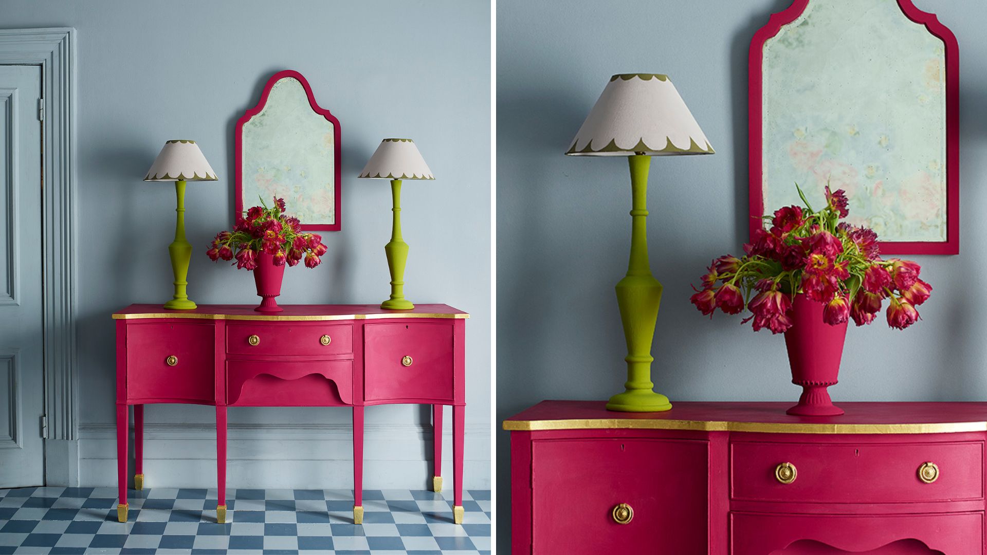
What better way to give a new lease of life to an old piece of much-loved furniture than a lick of paint in a transformative shade? Sometimes a piece of furniture, which has served a home well for many years, simply becomes outdated but not unneeded and therefore presents itself as the perfect candidate for a Pantone color of the year 2023 makeover.
"Viva Magenta is an uplifting, joyful, optimistic shade," says paint expert Annie Sloan, "the strength and dynamic combination of pigments in this hue give it its empowering, confident, celebratory energy. Choose Chalk Paint in Capri Pink, inspired by the hot pink," she advises for furniture and woodwork painting. "best of all you only need small doses to make a big statement."
7. Perk up an entrance with a bold front door
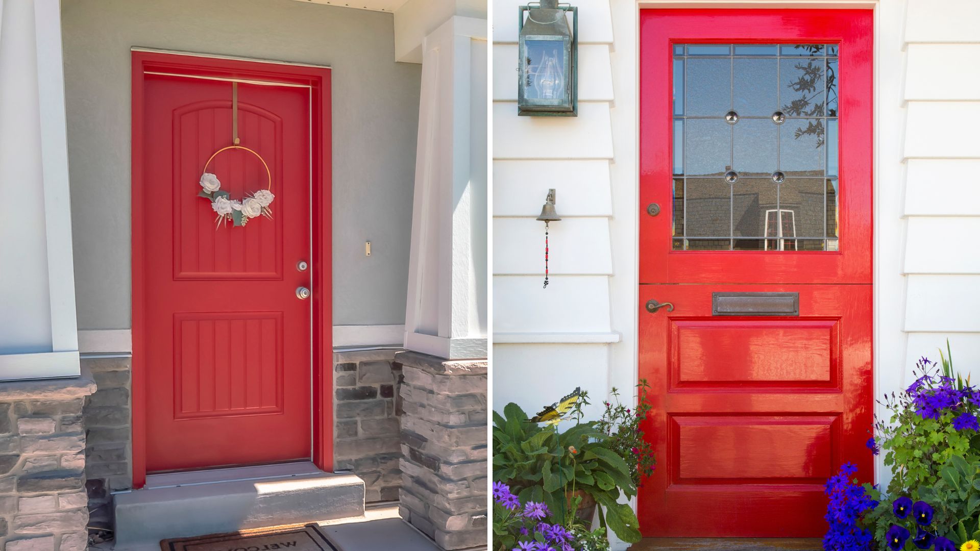
Repainting your front door can go a long way to making a good first impression – the impression being that you're totally ahead of the curve with your on-trend Pantone-inspired front door.
But seriously, when it comes to choosing the best colors for a front door, there's a certain element of freedom to break from the norm and use a shade that will suit your personality, such as this bold Pantone-inspired fiery red.
Using fashionable colors on a front door may feel like a big deal, but it's far less commitment than painting the exterior of your house – and also easy to do yourself (with the right primer and paint), plus easy to paint over once you fall out of love with it.

Tamara is a highly experienced homes and interiors journalist with a career spanning over 22 years. Now the Lifestyle Editor of womanandhome.com, she previously spent 18 years working with the style teams at Country Homes & Interiors and Ideal Home. With these award-winning interior teams, she gained a wealth of knowledge and honed her skills and passion for styling and writing about every aspect of lifestyle and interiors.
A true homes and interiors expert, Tamara has been an ambassador for leading interior brands on multiple occasions, including appearing on Matalan’s The Show and presenting at top interior trend forecasting events such as the Autumn Fair and Spring Fair.