The top 10 paint color ideas for a kitchen - from warm whites to color-pop pastels
Experts reveal the top paint color ideas for a kitchen, sharing what's trending right now - plus the timeless hues that will never date

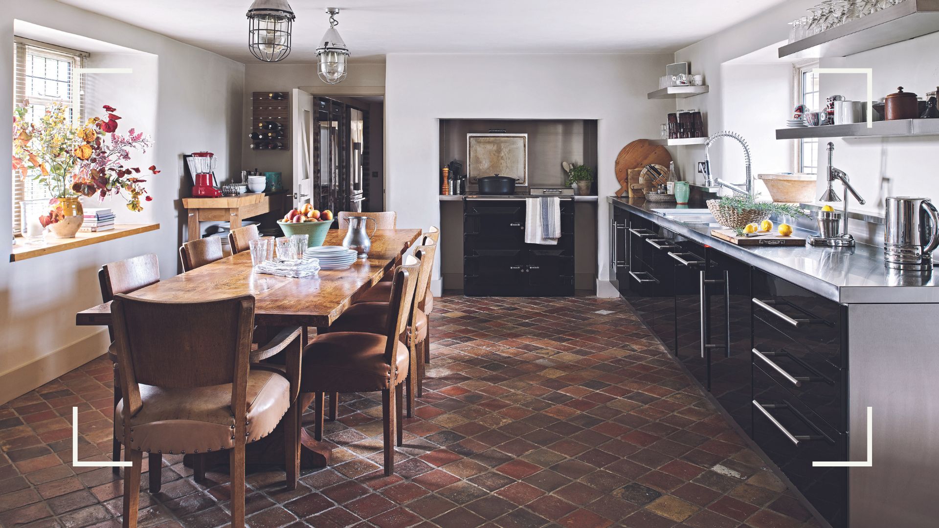
Poised to paint your kitchen? Paint specialists and interior designers have cast their votes for the best paint color ideas for kitchens, bar none.
It’s always exciting when the latest interior paint color trends drop but when it is for the kitchen, arguably your home’s most popular room, the pressure is on to get the color scheme right – because sometimes the wrong paint colors can devalue your home.
“If you’re really not confident with color, try starting by introducing accent colors in smaller areas first,” suggests Clara Ewart, Head of Design, Kitesgrove. “Whether it is a window frame, a favorite piece of painted furniture, or a colorful picture frame, these small pops of paint color will give your kitchen a lift and you can introduce more as your confidence grows."
Looking to make a bigger commitment but concerned you may go off your chosen paint colors long before a refresh is due? Just stick to the walls. It is far easier, quicker, and more affordable to repaint walls in emulsion than it is to switch out the color on cabinets, which require eggshell or gloss paint.
The best kitchen paint colors according to experts
1. Rich red
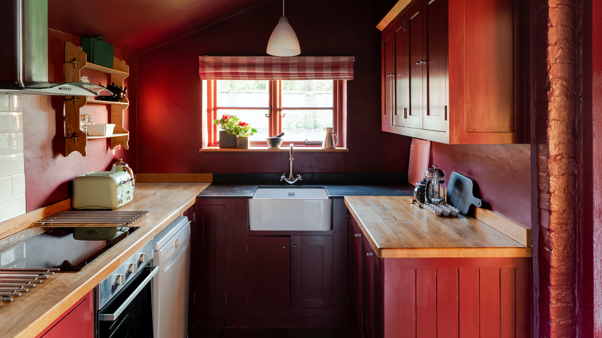
Studies have shown that our appetite increases when we see red and orange, which is why fast-food establishments favor these shades above all others. In a domestic setting, the bright, Ferrari reds found in commercial eateries can look garish. Instead, target your attention towards more sophisticated earthy reds like terracotta, burgundy, and burnt sienna.
This previously neutral cottage kitchen has been transformed with a top-to-toe application of Farrow & Ball’s Preference Red, a rich, dark shade that’s both high impact and welcoming. Choosing dark red in such a small space is a bold move, but one Farrow & Ball’s color curator Joa Studholme strongly advocates it. “Counterintuitively, using the same dark color on cabinets, walls and ceiling make the space feel larger,” explains Joa, “because you can’t see the distinction between the walls and the units.” A top tip for using paint to make a room feel bigger.
2. Color-pop pastels
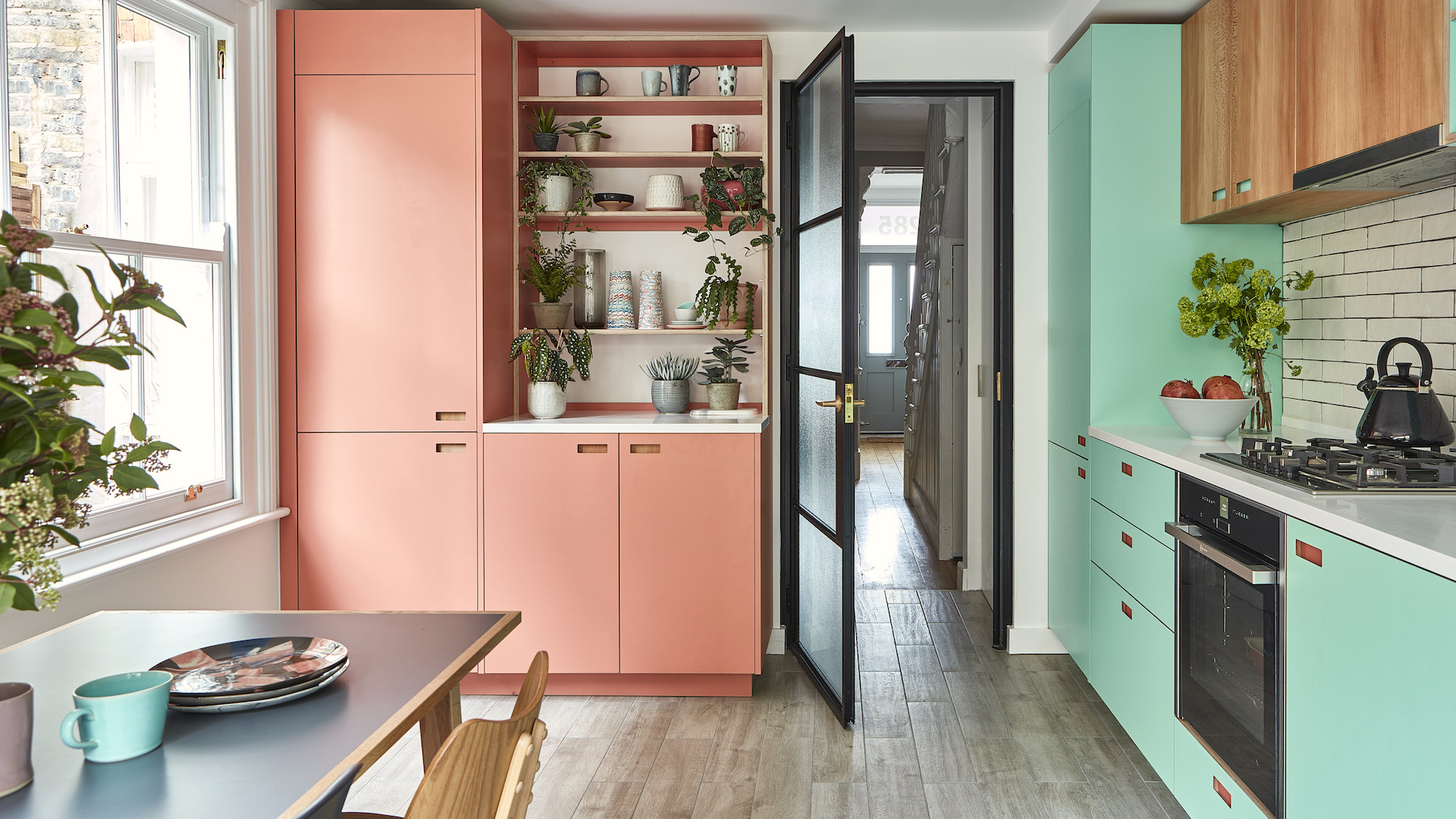
Minty greens and candy pinks look fresh and clean, a sweet combination in the kitchen. Dilute the sugariness with a punch of smart black on hardware and appliances. “It’s wonderful that we’re all much more open to using stronger colors now, and pastels are the perfect choice for injecting fun, uplifting color into your kitchen,” says interior designer Dean Keyworth, of Armstrong Keyworth.
Sign up to our free daily email for the latest royal and entertainment news, interesting opinion, expert advice on styling and beauty trends, and no-nonsense guides to the health and wellness questions you want answered.
“If you’re not ready to commit to pastel cabinetry, start by accessorizing with countertop appliances in cute pastel finishes, or try a feature wall,” Dean adds. Natural materials, such as timber flooring or wall cabinets, are a great way to ground energetic pastel shades, or choose pale, dusky pastels if you’re seeking a calm, but still very pretty, look.
3. Vibrant green
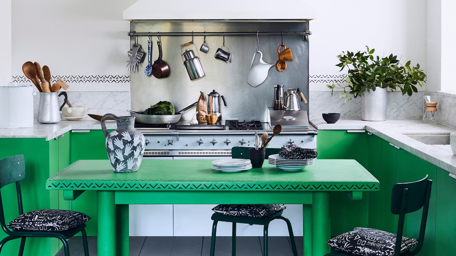
Sitting center stage on the color wheel, green is a flexible shade that can adapt to both cool and warm decor schemes. If you are aiming for a very clean, bright green, like this Antibes Green by Annie Sloan, make it ultra-fresh by combining it with a crisp white. And forget the notion that blue and green should never be seen; in the kitchen, they’re a winning combination.
“Bright greens in the kitchen wake you up in the morning and send you into the world energized and positive,” enthuses color and paint expert, Annie Sloan. “I’ve got the same grassy, fresh Antibes Green on my own kitchen cupboards and sideboards, with lots and lots of greenery and foliage for texture. It’s so fresh and complements my cooking style – organic ingredients in a back-to-nature environment.”
4. Warm white
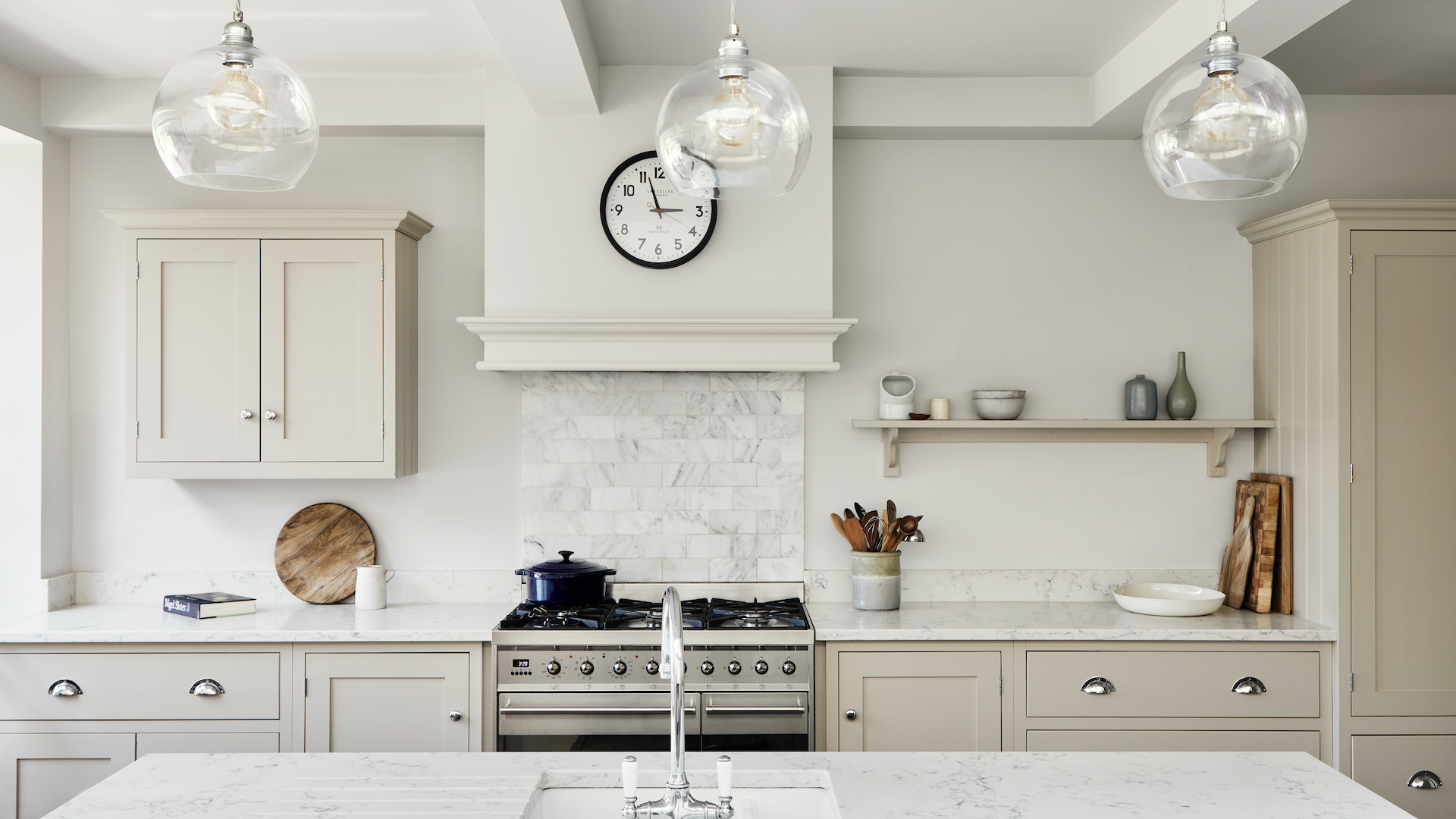
Going for a white-on-white scheme may sound like an easy win, but when considering the best white paint colors, it’s essential to make sure the white you choose has the correct undertones to avoid an unwelcoming cooking space. Cool whites have hints of a blue undertone, while warm whites have more yellow. Opt for cool white for cutting-edge contemporary or crisp coastal kitchens, and warm white everywhere else!
“All white kitchens can feel clean and fresh, however, they can also feel cold and flat in certain lights,” agrees Dominic Myland, CEO, Mylands. “An easy trick to introduce visual interest and warmth is to choose an off-white with a very subtle hint of warm color on the walls and amplify this on the cabinetry.
“For example, this kitchen features Mylands’ Limestone No.55 light grey on the walls which gives an overall feeling of light-filled freshness without feeling stark. This is complemented by the darker Egyptian Grey No.154 on the cabinetry to pull out the warmer tones, making it feel inviting and interesting to the eye at the same time,” adds Dominic.
5. Sunny yellow
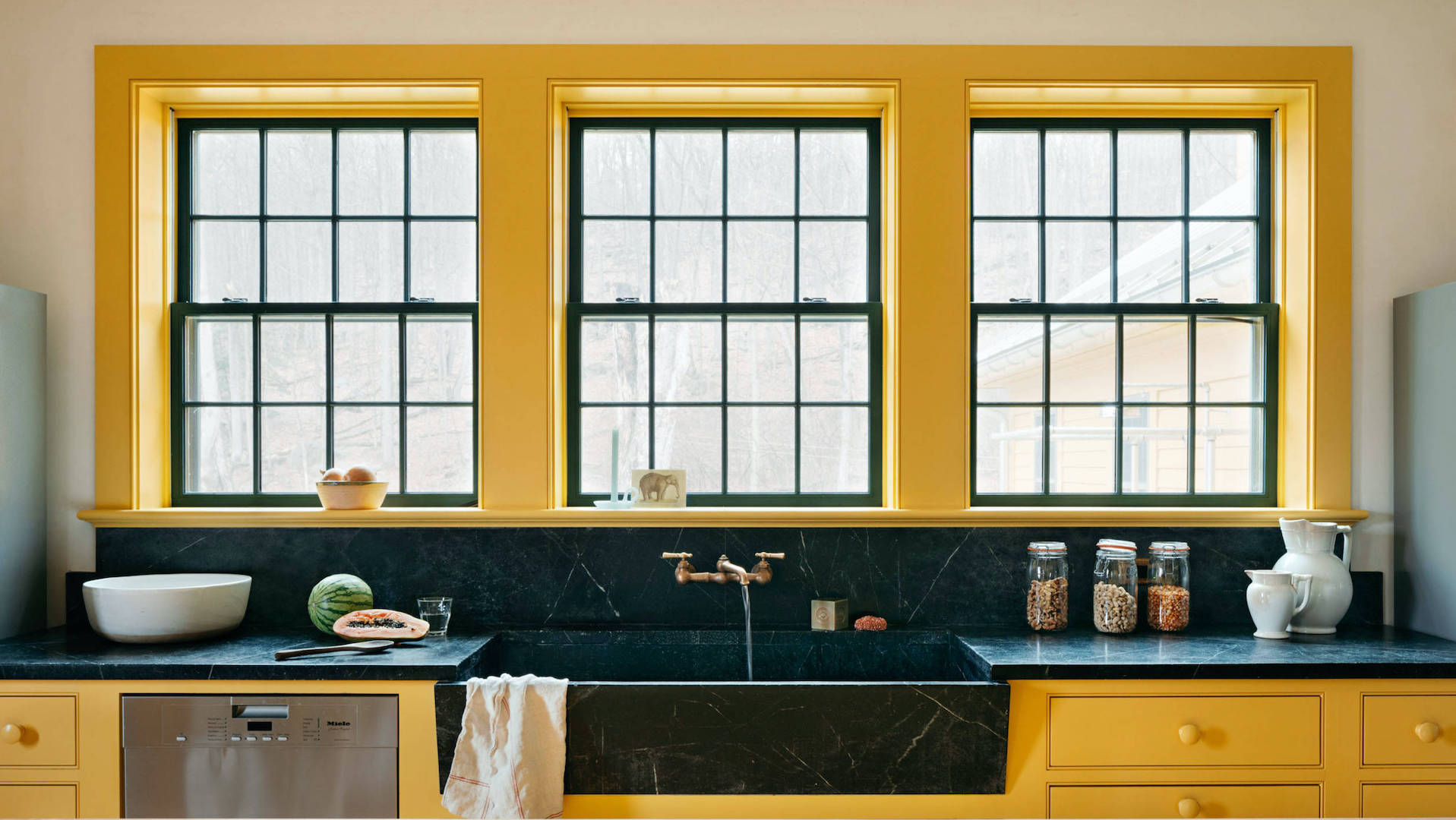
Embraced in a big way, yellow is a bold, versatile shade that exudes positivity and sunny warmth. In a kitchen setting, the most popular takes on yellow tend to have a slightly murky side, for example, ochre and mustard, which can prove more liveable than retina-searing lemon and florescent yellows.
Being cautious with your application of yellow will also allow you to cook without reaching for the sunglasses. Here, focusing bold yellow around the windows is a clever way to frame the views out of the kitchen.
“Keeping the millwork and plaster walls understated left plenty of scope for color experimentation,” recalls designer Rafe Churchill of Hendricks Churchill. “The quirky and bold personality of Farrow & Ball's Babouche gives this kitchen modern relevance and draws you towards the space."
6. Jewel tones
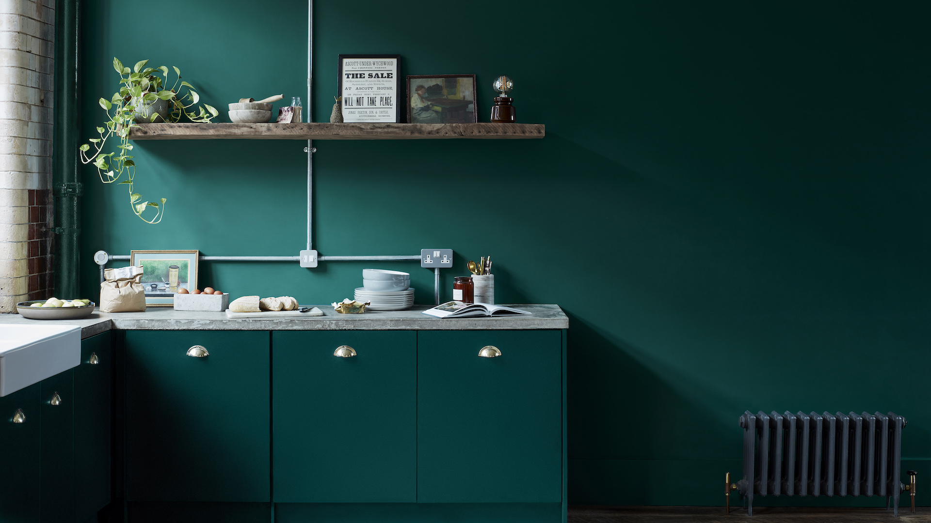
Jewel-inspired colors like emerald, jade, and sapphire will lend rich opulence to any kitchen. They work particularly well in North-facing rooms, where a lack of natural light can mean pale neutral shades appear washed out. By contrast, jewel tones have an inherent vibrancy that brightens and lifts dark corners.
These are not timid shades, so it’s important you really love them (if they feature heavily in your wardrobe, you should be safe), especially since they work best when used with vigor and enthusiasm. Crown Paints’ senior designer Justyna Korczynska recommends a color-drenching approach.
“Color drenching across walls and cabinets, especially when using darker brave colors, can transform a kitchen,” she says. “Bold saturated jewel greens and teals work very well for color drenching. Dark grays to near black and deep navy shades are also good choices.” This method of using paint is particularly effective when decorating with dark colors.
7. Jet black
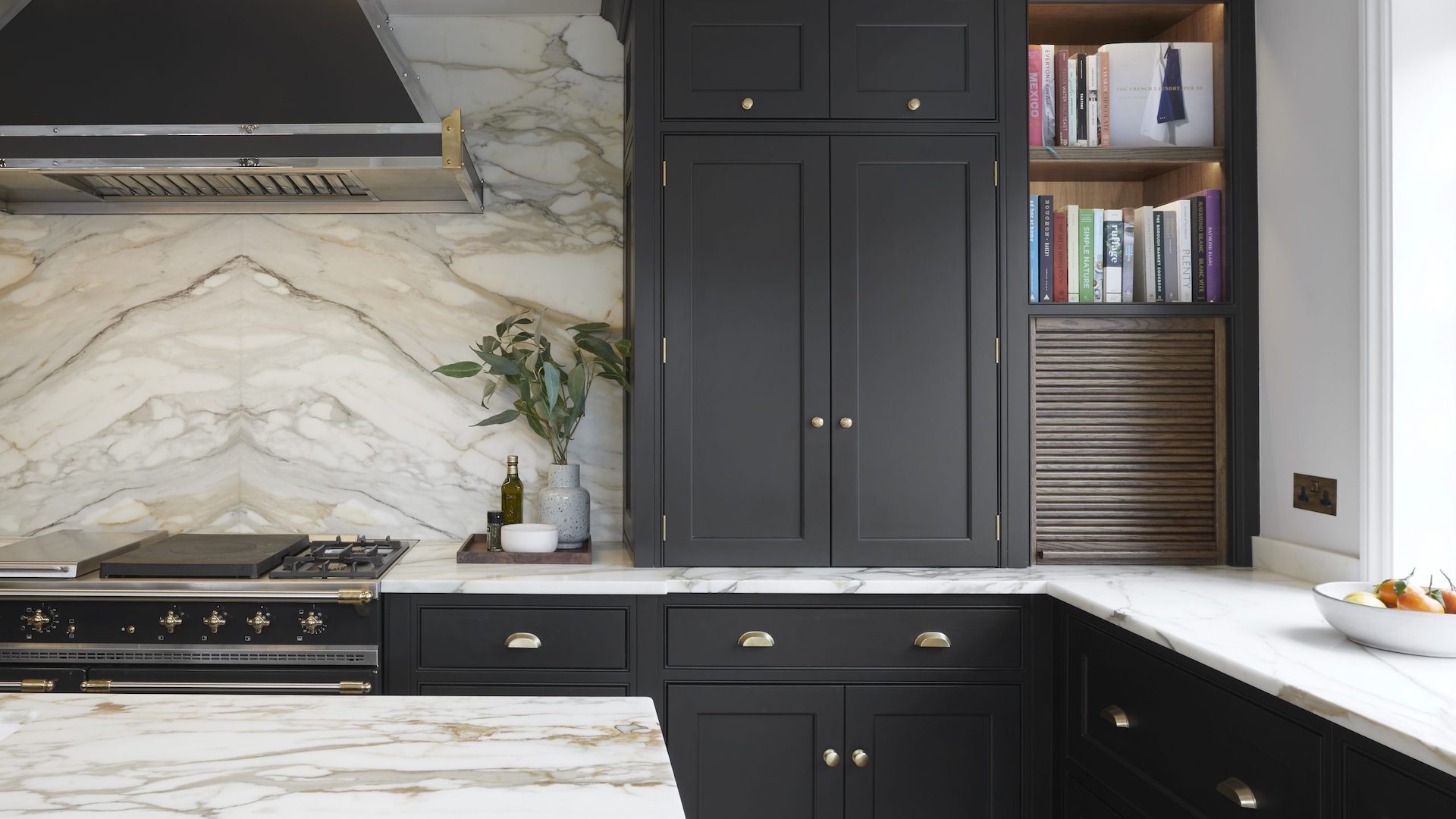
Seeking a classic look with a twist? Fashion’s most faithful shade is as timeless on a kitchen as it is on that Little Black Dress. Sophisticated and stylish, black can prove surprisingly easy to embrace as it goes with absolutely everything. Stay classy by mixing black with luxe marble and chic steel-trimmed appliances. For an edgier, industrial look, work black with rustic reclaimed timbers and salvaged factory fittings.
“Black is a bold choice for a kitchen, but it will instantly take it in a more dramatic direction,” says Peter Humphrey, design director and founder of Humphrey Munson. “Choose flat blacks over glossy shades, with undertones of gray or blue to achieve a cool, understated finish that reads well in both modern and traditional properties.”
8. Shades of blue
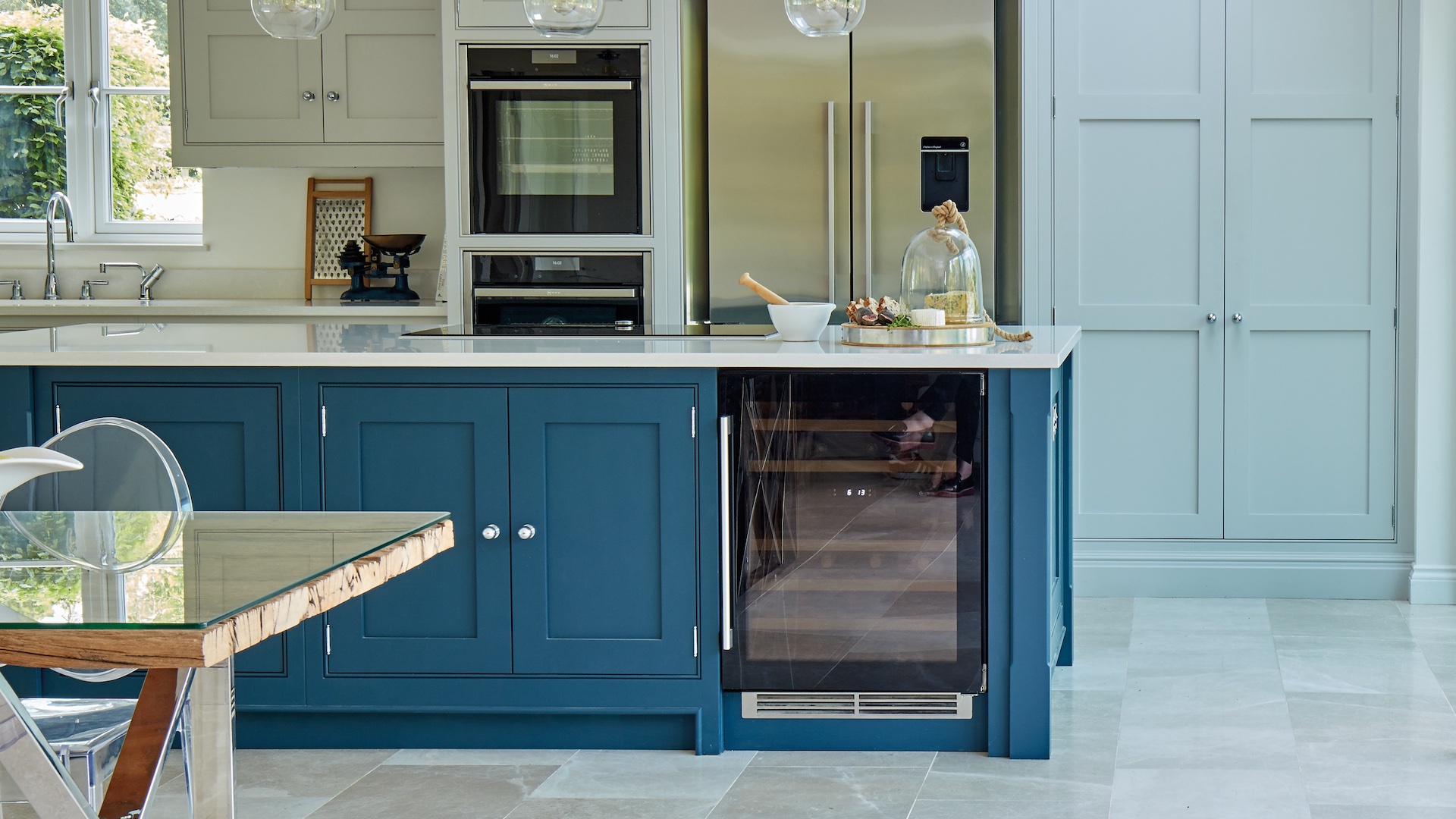
When mixing shades of blue, kitchen-maker Tom Howley recommends choosing no more than three colors and thinking about where you’d like to draw attention. “Use the boldest blue on the focal point of the kitchen, perhaps a decorative cooker hood, a kitchen island or an impressive double pantry,” Tom suggests.
“Then use lighter tones over the rest of the cabinetry and walls, enhancing and contrasting with the core ‘statement’ tone. To protect the feeling of spaciousness, reserve your lightest shades for the highest points, like wall cabinets, and use deeper blues below eye level to ground the space.”
Just as you’ll never tire of the sight of the sea or sky, so blue kitchens will always hold their appeal. Painting in varying tones of blue is a sophisticated way to add depth, without descending into chaos. It’s also perfect for those who love blue in all its many variations, from cute baby blue to rich, regal blue, navy, and beyond. Incidentally, it's these calming qualities that make blue such an appealing shade for the best bedroom paint color.
9. Dusky pink
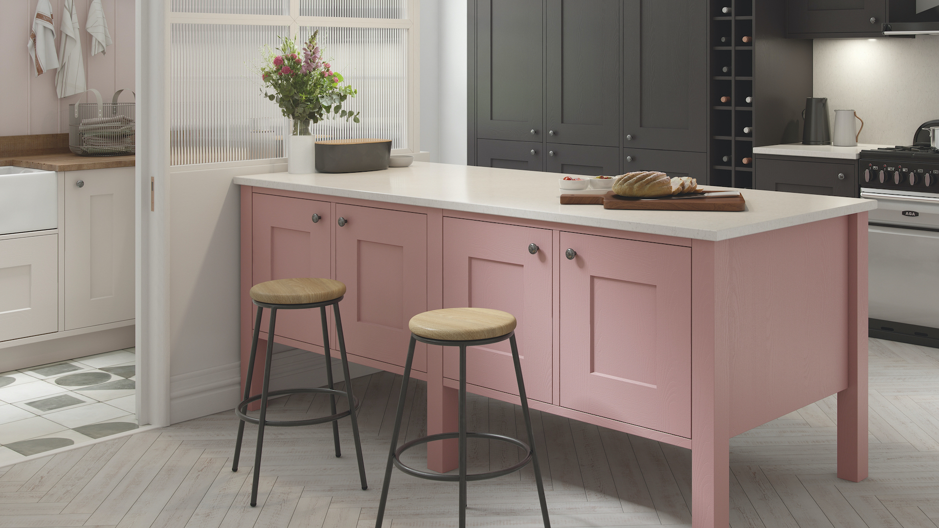
As a neutral with warming, yellow undertones, using the best pink paint colors is the cozy new way to do pale in the kitchen. Once considered “feminine”, pink is much more gender-neutral these days, and no longer relegated to the nursery or powder room. Vibrant “Barbie” pinks take a kitchen with a big personality to successfully pull off but can prove seriously high-voltage – even if only used in small doses.
“I love the warmth of pink paint but nothing too sickly. Dirty pinks work well in North-facing rooms. Look for a soft, creamy pink, which stays just on the right side of muddy. Warm metallics like copper and aged brass are perfect partners to pink in the kitchen,” says Anna Haines, director, Anna Haines Design.
10. Grown-up gray
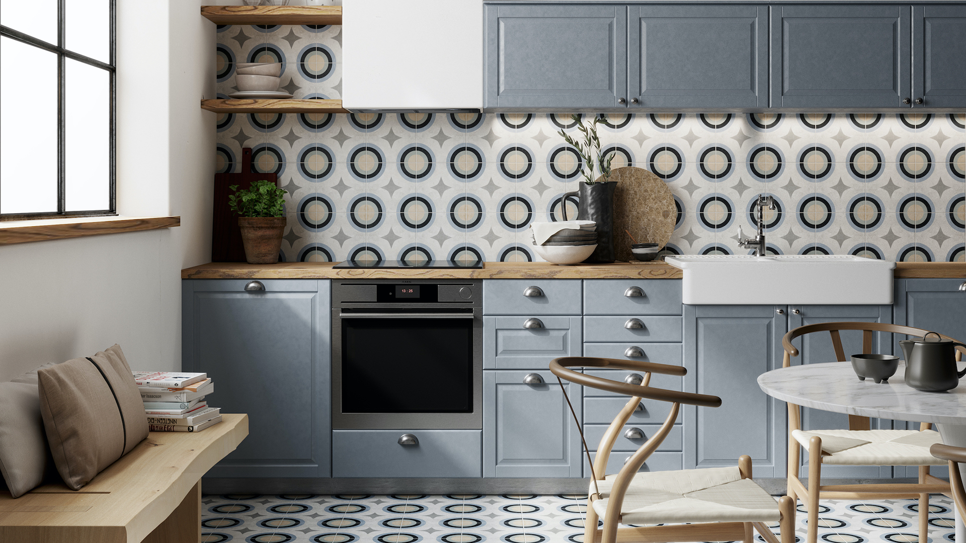
Gray is right up there with white when it comes to all-time classic paint colors for the kitchen, and most popular living paint colors, and is a fair match when it comes to enduring appeal, too. In a similar vein to a smart, tailormade suit, gray is inherently associated with maturity, elegance, and grace.
One of the difficulties of decorating with gray is the effect that daylight has on how the gray looks. The wrong gray, in the wrong light, can take on a faintly purplish shadow, which is only OK if you love lilac!
“When it comes to gray paint in the kitchen, it’s a classic color, very timeless and safe. We often feel very secure in gray because it doesn't ask anything from us and if you are quite a hectic person and you want your kitchen to blend into the background and be very elegant and subtle it’s a lovely option,” says Tash Bradley, director of interior design at Lick. “Another notable point about gray is how easily it complements other paint colors. Soft pink and light green both pair very nicely with gray, offering a lovely balanced feeling.”
Even once you’ve fallen for your perfect gray, don’t overdo it. Large expanses of gray can quickly take on battleship vibes – not exactly homely. Instead go for a tonal approach, using two-three shades of gray, to create layers of depth and interest.
What is the most popular paint color for a kitchen?
According to Google search data analysis, white remains in the top spot for the most popular color for kitchen trends in 2023. It is the color people around the globe who are seeking online inspiration search for, and with very good reason.
“White represents purity and cleanliness as well as new beginnings. Shades of white make the perfect timeless backdrop in the kitchen and color can easily be added through furniture, art, and accessories,” explains Clara Ewart, head of design, at Kitesgrove. “There are so many shades of white, which makes it incredibly versatile. We like to pick shades with an undertone of pink or yellow for a softer, more forgiving look.”
How do I pick the right color for my kitchen?
While there are no right or wrong colors for a kitchen, it is important to follow your heart rather than current trends or forecasts. Only you (and your family) have to live with your choices.
Most people are naturally drawn to certain shades, often subconsciously, so think about what colors you would usually go for when buying a new sweater or cushion for example. Color choices can also be inspired by a favorite piece of Art that will be in the room, or investment fixtures, like a range cooker for example.
It also helps to consider the natural light levels in the room, and at what time of day you spend the most time in the kitchen. Sunlight can make the same color look very different. A cold blue paint finish will look fresh in a sun-filled kitchen but positively depressing in one that lacks sunlight. Don’t be tempted to skip the part where you bring color swatches into the room and check out how they look depending on where the sun is in the sky.

An interiors journalist for more than 20 years, Linda Clayton has worked on a wide array of consumer titles, including Homes & Gardens, Livingetc, Country Homes & Interiors and Real Homes.
She graduated from Cardiff’s esteemed School of Journalism, Media and Cultural Studies with a First Class degree and Postgraduate Diploma in Magazine Journalism.