Experts reveal the best living room paint colours to transform every space
Experts reveal the best living room paint colours to update your home and complement your living room design this season

Lisa Fazzani
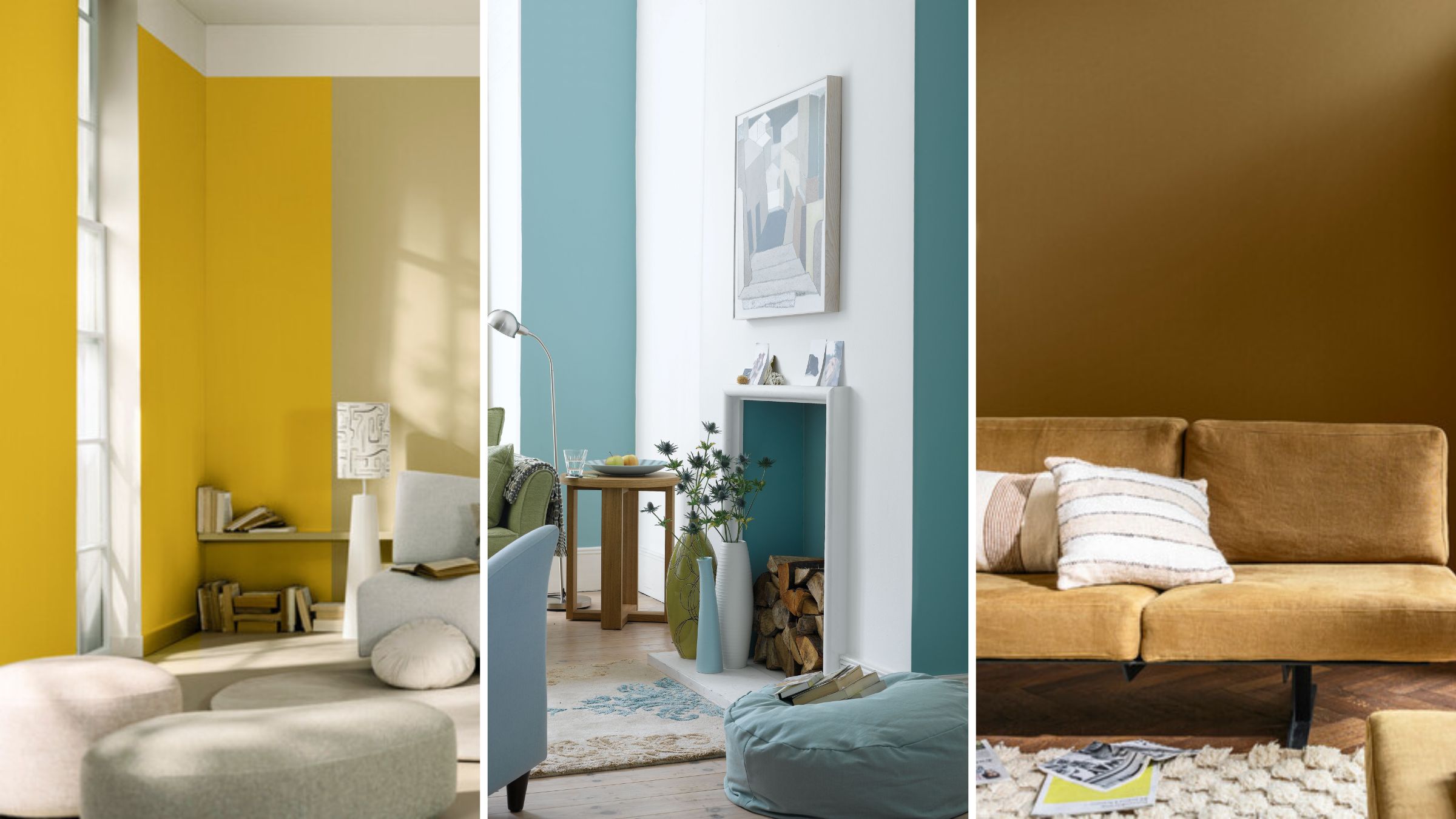
As one of the most lived-in rooms in any home decorating a living room is hugely significant for creating a space that feels inviting, comfortable and stylish in equal measure.
This is why we asked interior designers and colour experts to share their recommendations for the best living room paint colours – all perfect for refreshing your space and keeping you on trend this season. The colours selected by our team of experts provide a timeless foundation for your living room while still acknowledging the latest interior paint colour trends.
Choosing a new paint colour for your space is an easy way to transform your living room on a budget. After all, it’s much easier (and cheaper) to redecorate a living room with a splash of paint than it is to start a bigger home renovation project.
Best living room paint colours of 2024
Interior designers and colour experts share recommendations for the best living room paint colours to give your space a stylish revamp.
Of course, paint colours need to be to your liking which is why the experts have offered various colours with different hues and undertones. This way you’ll be able to find inspiration no matter what colour scheme you already have running through furniture and accessories.
1. Calming green
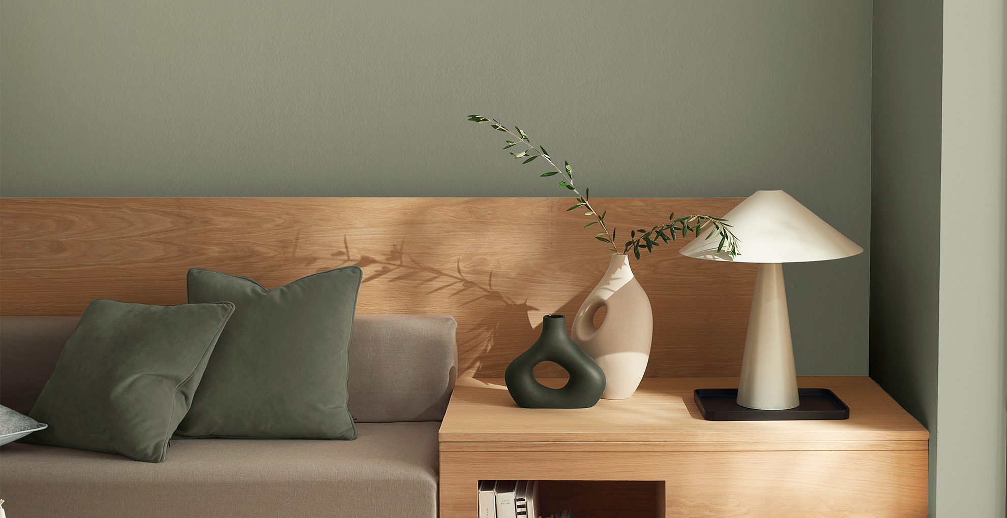
Sage by Graham & Brown
Over recent years there’s been a big move towards relaxed and restful living room schemes that are a sanctuary of tonal greens, leafy prints, and soft and soothing textiles. While darker greens are starting to compete for the top spot Sage green is still currently the biggest colour trend of all the green shades.
Green is the colour of 2024, taking the number one spot as the most searched-for living room colour, and one of the most searched-for sofa colour trends.
Sign up to our free daily email for the latest royal and entertainment news, interesting opinion, expert advice on styling and beauty trends, and no-nonsense guides to the health and wellness questions you want answered.
The popularity of green is all part of the biophilic trend that sees interiors connected with nature and choosing a mix of calming chalky green paint colours will help create the perfect tranquil backdrop that can be the basis for a chilled living room scheme and why it also makes for an ideal bedroom paint colour.
"An appreciation of the natural world, our trending paint palette showcases modern minimalism, with beautifully crafted furnishings and a quiet palette of neutral tonal colour," says Kathryn Lloyd, Colour Consultant at Crown Paints. "Homeowners are now wisely considering exactly what they place in a room – so much so that space becomes carefully curated. The result is a retreat consisting of dry, chalky, comforting textures and single-use, easy on the eye, colour."
“To use contrasting colours of the same shade, play with a mix of tones from the same colour mix," suggests Paula Taylor, head stylist at Graham and Brown. "For example, try forest green paint with sage green for a layered look and added warmth to a living room."
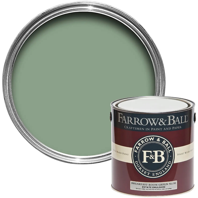
RRP: £56 | Farrow & Ball's cheerful shade of Breakfast Room Green, No.81 is slightly more lively than sage green, but muted enough to hold the same soothing qualities. The name is taken from east-facing rooms designed for breakfast, implying this green is made to be seen at its best in natural daylight.
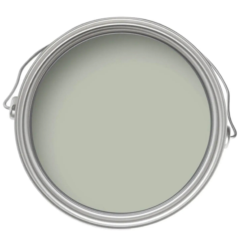
RRP: £18 | As the name would suggest this soothing shade of green is ideal for creating a tranquil backdrop that can be the basis for a relaxing living room decor.

RRP: £48 | Ideal in a matt paint finish this dusky green colourway has a chalky aesthetic that enhances the tranquillity of the natural-inspired shade. The organic appearance makes it easy to style and perfect if you’re looking for an effortlessly chic living room scheme.
2. Uplifting pink
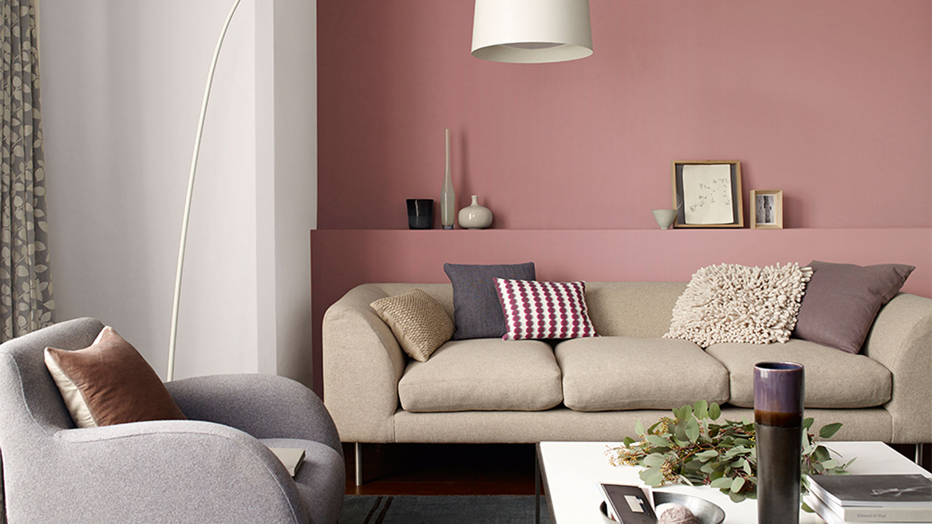
Dulux's 'Blush Noisette 2'
Pink loses its sugary sweetness in modern decorating schemes and takes on more muted, earthy tones, making it a versatile colour option for any living room. While not quite neutral the best pink paints can be warm and grounding and work well with plenty of colour combinations.
Pink as the main colour pairs perfectly with accents of greys, browns, smart navy, or lush green, making it a good all-around choice as a living room background colour.
"Pink is perfect for a living room where you want a look that is joyful and uplifting," says Marianne Shilingford, creative director at Dulux. Further explaining why pink is a happy paint colour she says: "Pink can be a bit cheeky, but it's ultimately warm and super relaxed. It captures a sense of gentle fun and is perfect for warming up north-facing rooms where soft pale shades with just a hint of apricot look amazing teamed with lots of houseplants and verdant green accessories."
"Punchy petal pink shades are perfect for a contemporary look with a bit of energy but if you prefer a gentler vibe that will make you smile rather than giggle, calm it down with blush pink, warm nudes, or soft powder pink." Dulux Colour of the Year 2024 'Sweet Embrace' is a fine example of a pink so pale it's almost neutral.

Marianne Shillingford is the creative director at Dulux and founder of The Colour in Design Awards. With a career spanning 30 years, Marianne knows how to create magic with colour and shares her passion for colour and decoration on her website.
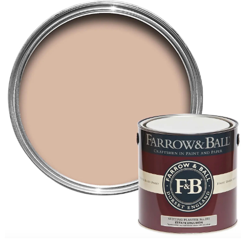
RRP: £57.50 | As the iconic name suggests 'Setting Plaster' is a dusty pink that closely resembles the colour of freshly plastered walls. This natural shade of pink boasts yellow undertones to create a softness that avoids feeling too rosy and pastel-like.

RRP: £33.11 | A darker shade of pink but still with an element of grey that tempers the tone welcoming an earthy, sophisticated edge that prevents it from feeling too sickly and sweet.
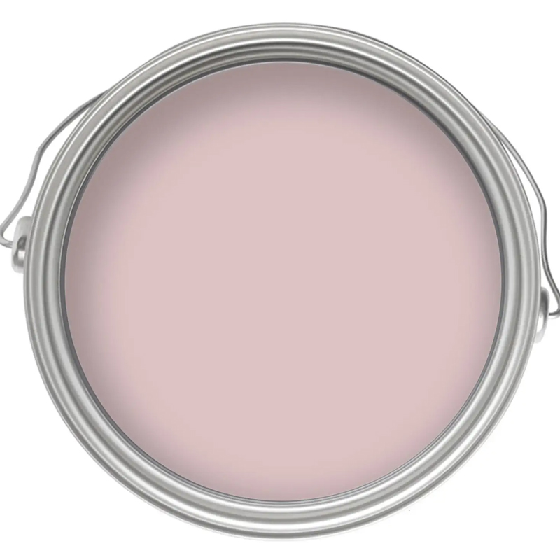
RRP: £15 | Pale pink with a hint of lilac undertones to make this a perfectly pale dusky pink that remains cool in natural light but still with enough warmth due to the rich pigment. The matt smooth finish helps to add to the chalky appeal of the shade.
3. Warm white
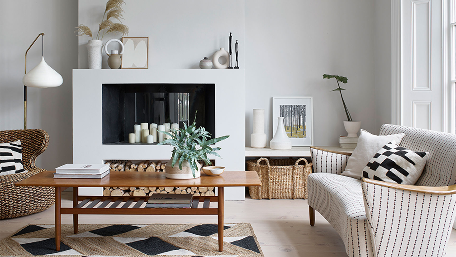
Dulux's 'Romney Wool'
coloursWhite is often avoided when it comes to living rooms as it can make a space feel harsh and clinical, perhaps choosing to decorate with magnolia paint colours instead. But this is only true if you opt for the wrong shade of white.
White can have warm or cool undertones and there’s a shade for every room - and used well, white can look striking. The key is to find the best white paint colour for your space.
Opt for white with yellow or red undertones in a north-facing living room - these will help lift the space and make it feel more warm and cosy. Avoid blue or grey-toned whites which can feel dark and dismal. In south-facing living rooms that get plenty of natural daylight, opt for cooler-toned whites which will counter the warmth of natural light and create a more balanced glow.
"Believe it or not, white is the combination of all colours of light mixed together," says Marianne. "It has magical powers in decorating and since we began to create it in paint, it has been the ultimate blank canvas onto which we tell the story of our lives on the walls of our homes.
"Of all the colors, white reflects the most light and so we use it to make small dark rooms look bigger and brighter, ceilings look taller, colours look more impactful, and woodwork gleam. You could also say that white is the ultimate neutral because it works with everything. There is however more to white than meets the eye."
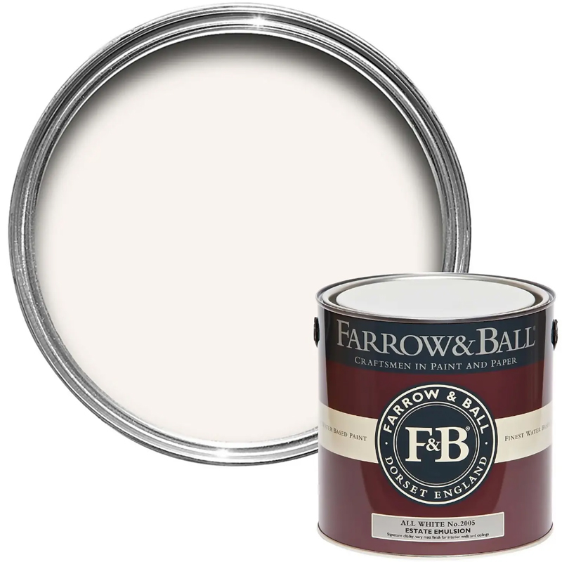
RRP: £57.50 | Farrow & Ball have produced the perfect shade of white that unusually features no other pigments to cater to those devoted to pure white but do not want the blue undertones so commonly associated with white – it's the blue that can so often make white feel cold.
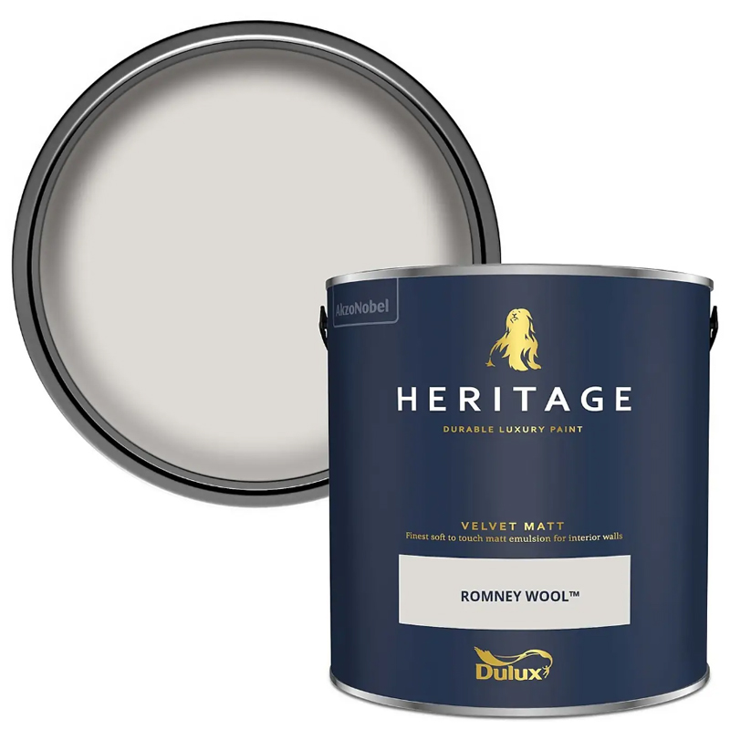
RRP: £46 | This white feels almost like the palest of pale greys, with a slight hint of sage in certain lights catering for those who would rather air on the side of cool than go creamy with white walls. But thanks to the balance of pigments this tone still offers a warm white finish.
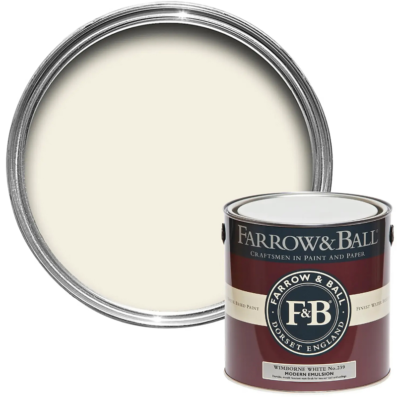
RRP: £85 | This warm white features a very slight yellow undertone to make it a degree warmer than pure white, just enough to make it ideal for adding just a dash of warmth when using white – but not so much so that the white ends up feeling creamy, which is often the case.
4. Pale grey
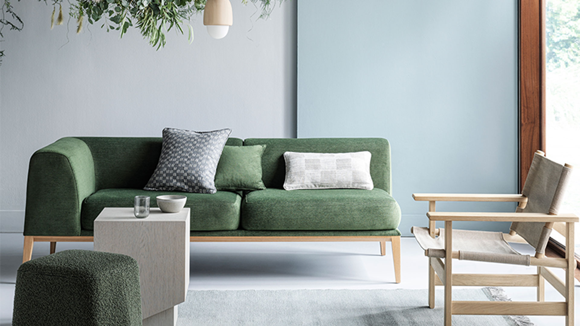
Crown's 'Needles & Pins'
Decorating with grey shows no sign of losing its popularity any time soon. The biggest-selling paint colour after white, grey has secured its place as the modern, go-to neutral. That being said, grey isn’t a one-shade-fits-all colour.
It’s important to choose the right shade of grey that will suit your living room, so always consider how much light your living room receives and whether you need a cool or a warm-toned grey to counter this.
Colours with a cool undertone, such as blues and other greys, will complement grey walls well, while colours with warm undertones like terracotta or burgundy will contrast the shade and bring a touch of warmth into the space.

RRP: £57.50 | A greenish-grey is a warming neutral shade that lends towards a stone or putty shade in tone. This versatile grey adds warmth to a calming neutral colour scheme. Thanks to the depth of tone this grey is ideal for pairing with punchy accent tones of pink or deep greens.
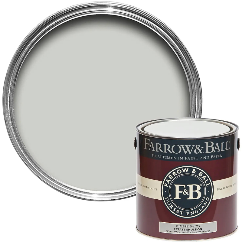
RRP: £57.50 | This light, sophisticated grey features gentle blue undertones which create a subtle depth of shade. This delicate grey is accentuated by natural light and architectural details, adding interest to the tone by how it plays with the light.
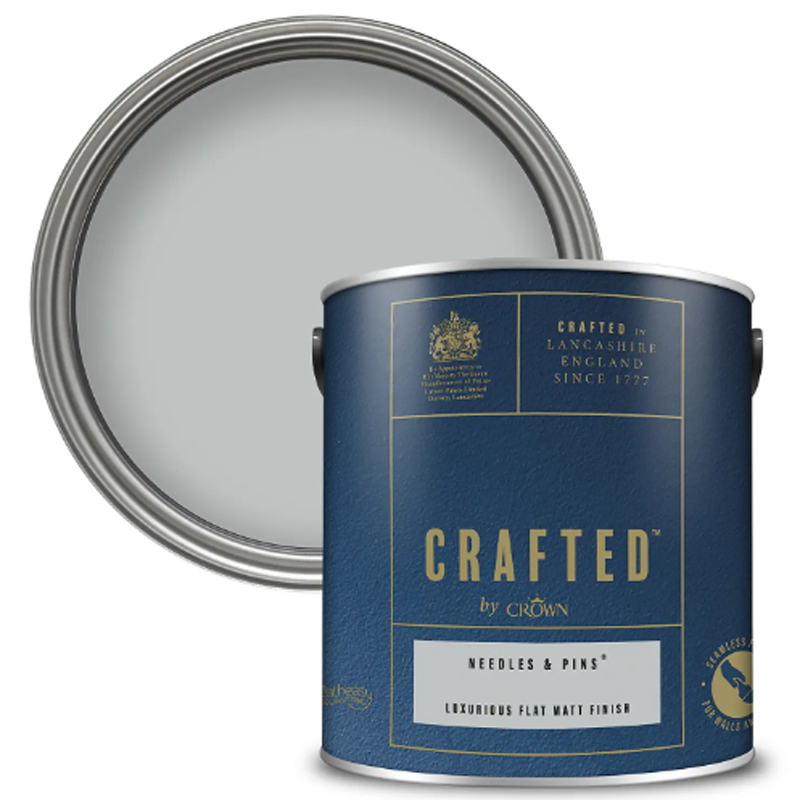
RRP: £32 | Pale and interesting this soft grey is ideal for use in a living space that craves calm. Almost off-white with a hint of grey this calming neutral is an effortless colour to build upon with strong accents via textiles and furniture choices – for example, a lush green sofa as above.
5. Sky blue
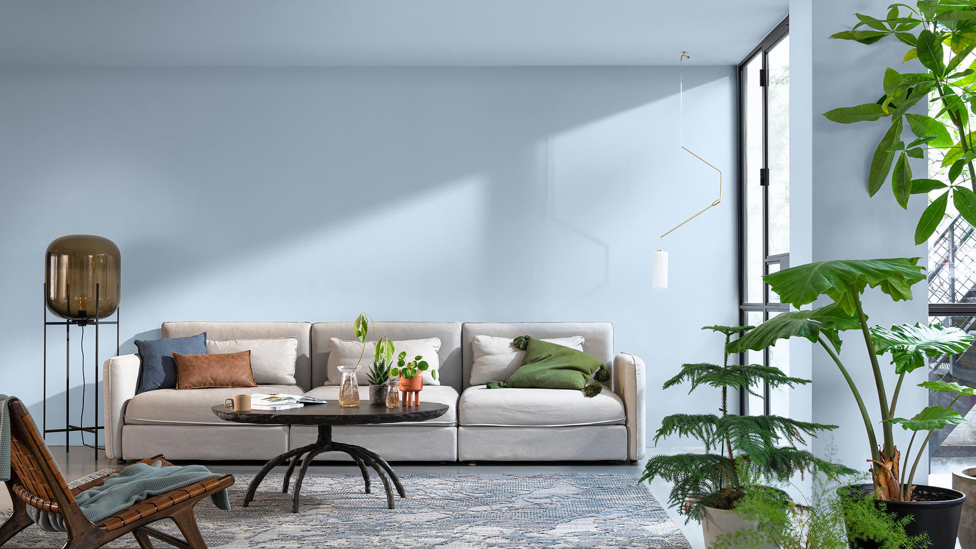
Dulux's 'Bright Skies'
The latest trend of cooling shades indicates that blue tones remain to be big news for living room paint colours this year. Fresh and uplifting to offer calming qualities, these hues create a sense of calm in the room where you want to relax and unwind.
The Dulux 'Color of the Year 2022' Bright Skies was thoughtfully chosen by the paint experts to fulfil a desire for an airy and fresh tone that breathes new life into any space, especially busy living spaces. It appears our homes still crave that sense of freshness as the colour continues to soar in popularity.
Speaking about the shade of pale blue Marianne says that "people want to feel revitalized and enjoy the freedom of outside, to look out and bring in new ideas.
"What better inspiration can we take than the endless skies around us? It is widely known that nature makes us feel better and taking steps to bring the outside in enhances our sense of wellbeing," she continues. "So whether we are working or relaxing, creating or exercising, it is essential to have a space that reflects the optimism and desire for a fresh, new start."
The thinking is that a dreamy shade of sky blue can help to enrich the soul and make our surroundings feel more hopeful by bringing positive energy into our homes.
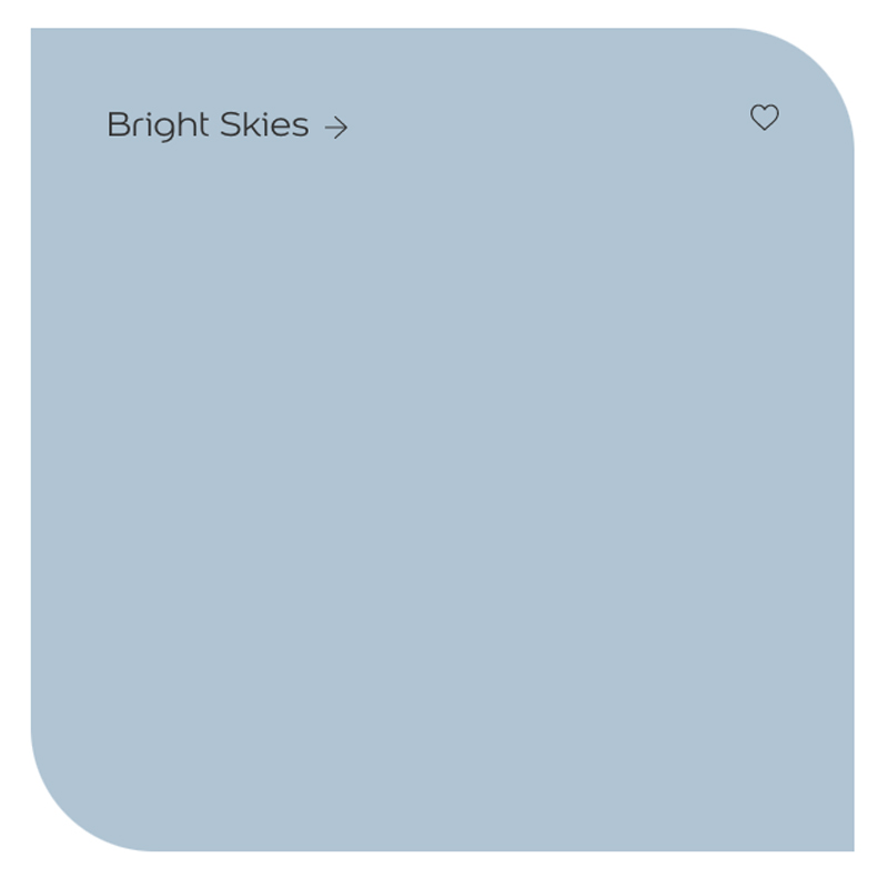
RRP: £32 | As 'Color of the year 2022' you can't get a much better blue living room paint colour than Bright Skies right now, the perfect hue to create a sense of hopefulness for your home. The pale blue works in all light aspects, it simply darkens with shade but remains a true blue.
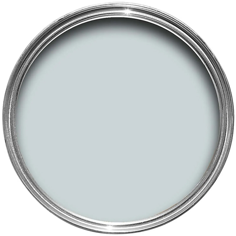
RRP: £56 |This pale and intriguing blue is also inspired by the colour of summer skies, hopeful skies that remain filled with radiant light quality. Thanks to the bright and airy nature of this shade it works equally well in bright spaces or light-deprived living rooms, holding its own in all settings.

RRP: £20 | Closer to a pastel blue this summer-inspired blue feels bright and optimistic. The strong pigment of this blue shade is welcome in any light quality, from big bright living rooms to small, darker spaces it will still feel airy and luminescent.
6. Soothing lilac
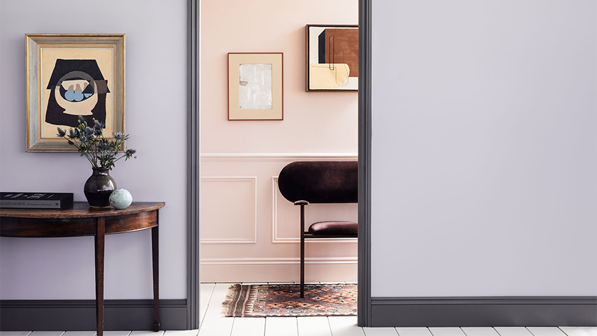
Myland's 'Lavender Garden'
Lilac is another underrated colour that is back in vogue for 2023. Soft and sophisticated and a less girly option than pink, lilac is a big trend in fashion right now and it seems that interiors are following suit.
Unlike Pantone's Color of the Year of 2022, this new shade of purple is softer and more restful. Lilac sits on the cool side of the colour spectrum so can feel chilly in north-facing rooms, but in south-facing living rooms with plenty of natural light, it will feel cosy, warm, and welcoming.
"Lilac is traditionally a romantic and feminine hue, but is increasingly popular for many rooms in the home thanks to its subtlety and adaptability," says Dominic Myland, CEO of Mylands.
"We’re noticing more and more customers choosing lilac for their interiors because it adds a pop of colour, but isn’t overwhelming or intimidating like other, bolder shades, and its versatile nature means it pairs well with a myriad of colours."

RRP: £55.50 | This gentle desaturated shade of lilac offers a chalky, mineral quality with undertones of grey to ensure it stays on the cooler scale of lilac. While cool in temperature this tranquil tone is the perfect backdrop for welcoming warming accent shades via soft furnishings and accessories.
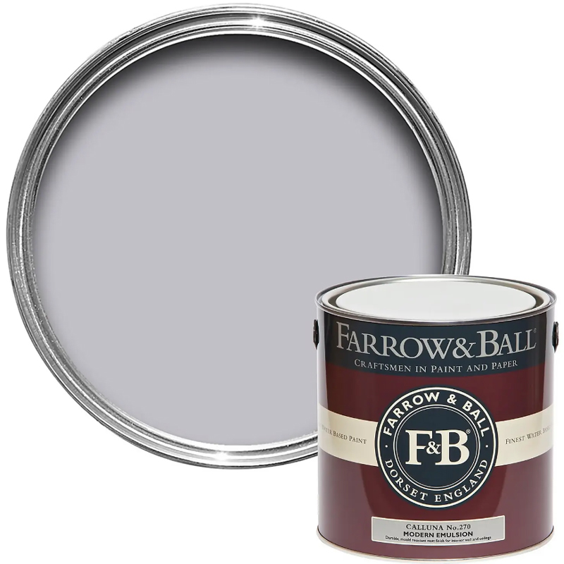
RRP: £56 | Inspired by Scottish heathers this tranquil lilac shade is grounded with a dash of black to prevent the colour from looking pinky, instead it retains an element of grey associated with true tones of lilac.

RRP: £103 | For a strong take on the lilac trend this shade features heavier undertones of purple plums to make it feel more intense, as opposed to a more grey lilac. This shade is an idea for those who are looking to make more of a bold statement with this on-trend hue.
7. Warming yellow
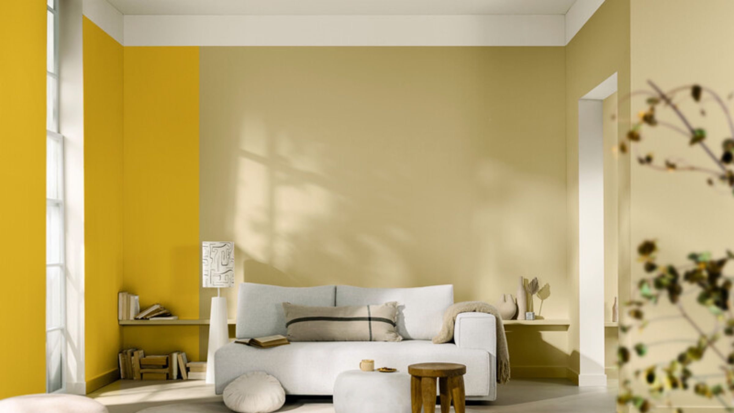
We're seeing a real comeback for this happy colour, with Dulux's Colour of the Year 2025 True Joy being a bright and energising yellow. Versatile and welcoming, opt for mellow mustard or classic ochre yellow in living rooms, which will feel richer and cosier than pale and buttery shades. Yellow works much like a neutral, partnering perfectly with warm woods and metallics or dark accent black and navy.
"When choosing colours for your living room – think about how you want to feel in the space," says Anna Hill, Brand Director at Fenwick & Tilbrook. "Do you use it most during the day or in the evening? This will impact the way the colour looks as bright natural light vs. artificial lamp light will give a very different aesthetic. If your goal is for a cosy feeling, don’t shy away from deeper colours but steer towards natural, muted tones rather than vibrant hues to aid relaxation.
"It’s also good when choosing colours to think about not only the shades you like but the age of the property and any architectural details that could be accentuated with colour. An ornate ceiling rose could look stunning painted in a darker shade, using the fifth wall to bring the room to life."
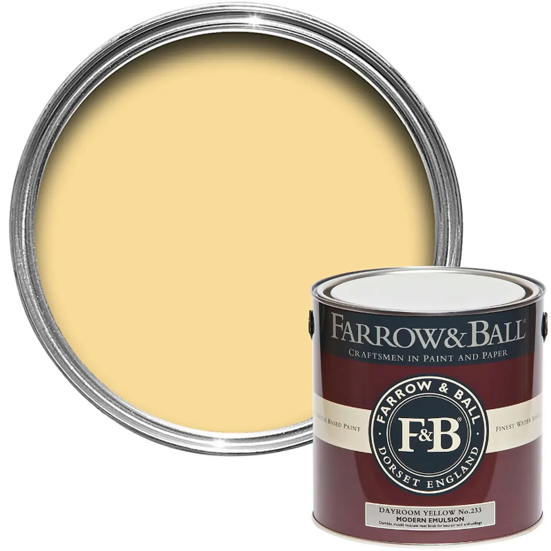
RRP: £57.50 | This refreshing sunshine yellow is ideal for light-filled rooms, as the name suggests the simple shade is ideal for rooms with a sunny deposition. That's not to say it can't be used to brighten up a north-facing room, but plentiful natural light makes this hue come alive.

Chalky Matt Emulsion £55 per 2.5L: Morris & Co's Weld Yellow packs a punch of feel-good sunshine vibes. The shade is inspired by the bright yellow substance of the weld plant. Thanks to the chalky finish this strong and purposeful shade of yellow feels natural and somehow soft. Ideal for welcoming an uplifting glow to living rooms.

RRP: £20 | This rich shade of nostalgic yellow has the same warming qualities as mustard yellow, naturally darkened with a touch of black to ensure the pigment stays strong without feeling bright. This deep concentration of colour would feel beautifully inviting and intimate in a small living room, creating a cosy aesthetic.
8. Almost black
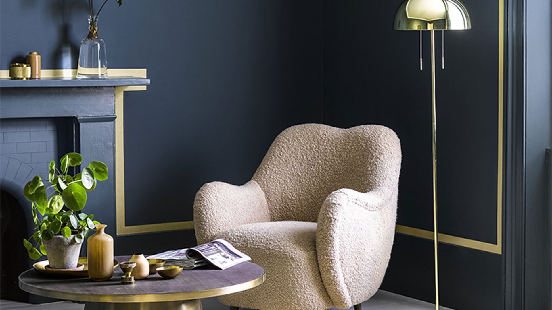
Benjamin Moore's 'Mediterranean Teal'
Black is a brave choice for a living room, but experts agree that it is guaranteed to bring drama and a theatrical quality to a living room to give a home personality.
. Jewel colours, such as gold, fuchsia, turquoise, and lime will pop against a dark backdrop for a smart, Deco-inspired style. Or, for a more relaxed, boho vibe team that is big in bedroom trends this year, black with soft neutrals, sage greens, and blush pinks with plenty of woven macrame, house plants and greenery to accessorise.
"Eclectic Boho has been a popular style for a while, and this new look moves the trend forward to create a sleeker, smarter, and tailored interior," says Helen, at Benjamin Moore.
"Paint walls and woodwork in a deep, dark base shade, then add a trim detail in a contrasting accent colour to highlight features in the room such as fire surrounds and window frames. Complete this sophisticated scheme with the Boho staples: textured Berber rugs, vintage furniture, plenty of plants, and brass accessories."

RRP: £47.50 | Interior designer Abigail Ahern is the master of decorating with dark colours! This deeply intense shade of Noir is a muddy hue with an earthy quality thanks to the strong undertones of rich plum that blend with the black to create a beautifully moody shade ideal for creating a cocooning, restorative living space.
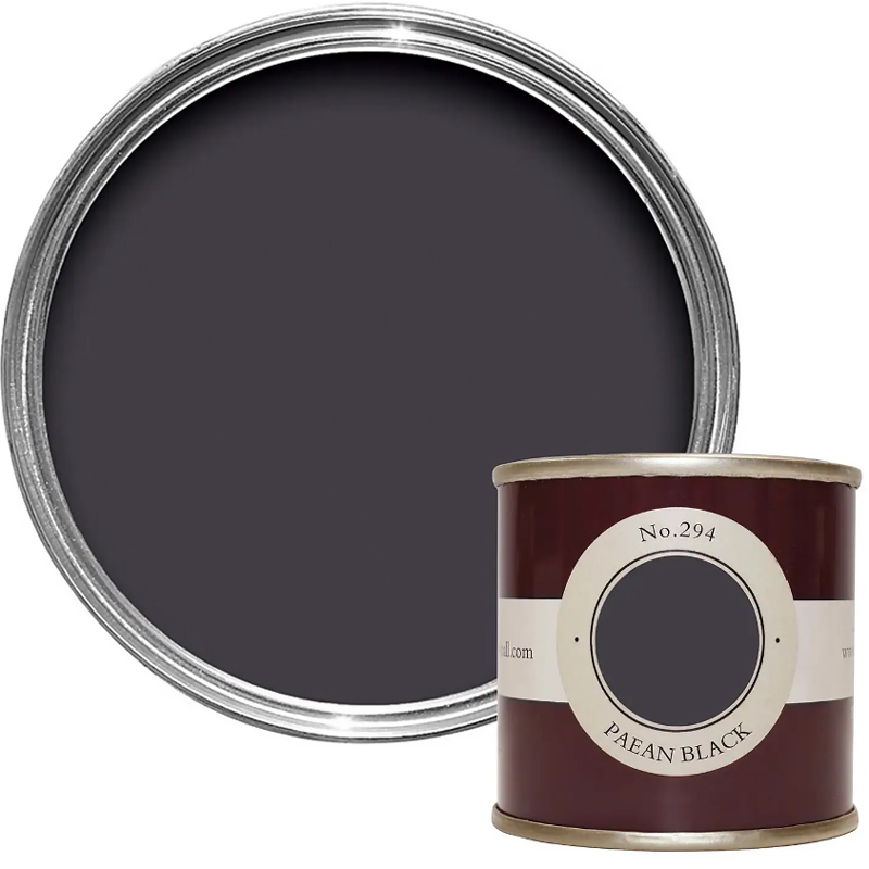
RRP: £63 |: Dark enough to feel like black but warm enough to avoid living room walls from feeling flat, like a theatre backdrop. This dark pigment is tempered with red undertones to give it a warming quality that prevents it from feeling cold and uninviting as a wall colour.

RRP: £103 | Almost black but ever so slightly green with a hint of grey, this multileveled shade is ideal for creating a striking style statement but feels more forgiving than true black, balanced by the warm undertones that make it enveloping in all the right ways.
9. Grounding brown
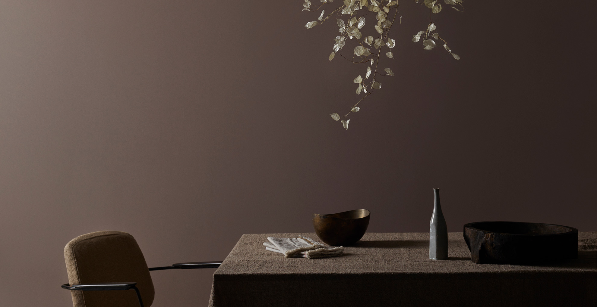
Inspired by the resurgence of retro 70s style interior design trends, shades of brown are back in a big way. In addition to dark wood flooring trends and rich brown upholstery, the shade is taking over walls too with brown paint becoming one of the most popular shades of the year as a truly grounding tone that evokes a sense of calm.
“Brown has a moody, sophisticated feel and adds great depth to interiors," explains Francesca Wezel, founder of Francesca’s Paints. "It pairs wonderfully with light or bright pink, dark blue, and off-white, as well as sandy tones and terracotta."
“Many of my colours are inspired by nature and brown occurs regularly in the natural world. My color palette includes a variety of brown shades including, Love & Squalor, Earth, Cohiba Brown, and Cappuccino.”
Francesca is so fond of decorating with brown that she has painted her own living room brown, saying: "My living room is chocolate brown and I feel that I am enveloped and protected by it."

RRP: £35.50 | Benjamin Moore describes this rich paint color as: "A stylish brown-black that evokes freshly roasted espresso beans." The brooding shade is perfect for a rustic-style living room that is looking for a warm, saturated color on the walls to create a comforting feel – much like a warm mug of espresso in fact.

RRP: £59 | This warm and charming brown exudes an air of greyness to it, making it the ideal shade to pair with soft grey neutrals and off-white upholstery and soft furnishings in a living room. Farrow & Ball describe London Clay as being: "loaded with magenta pigment" that prevents the undertones from feeling flat and cold instead offering a rich, earthy hue to add elegance to a living space.
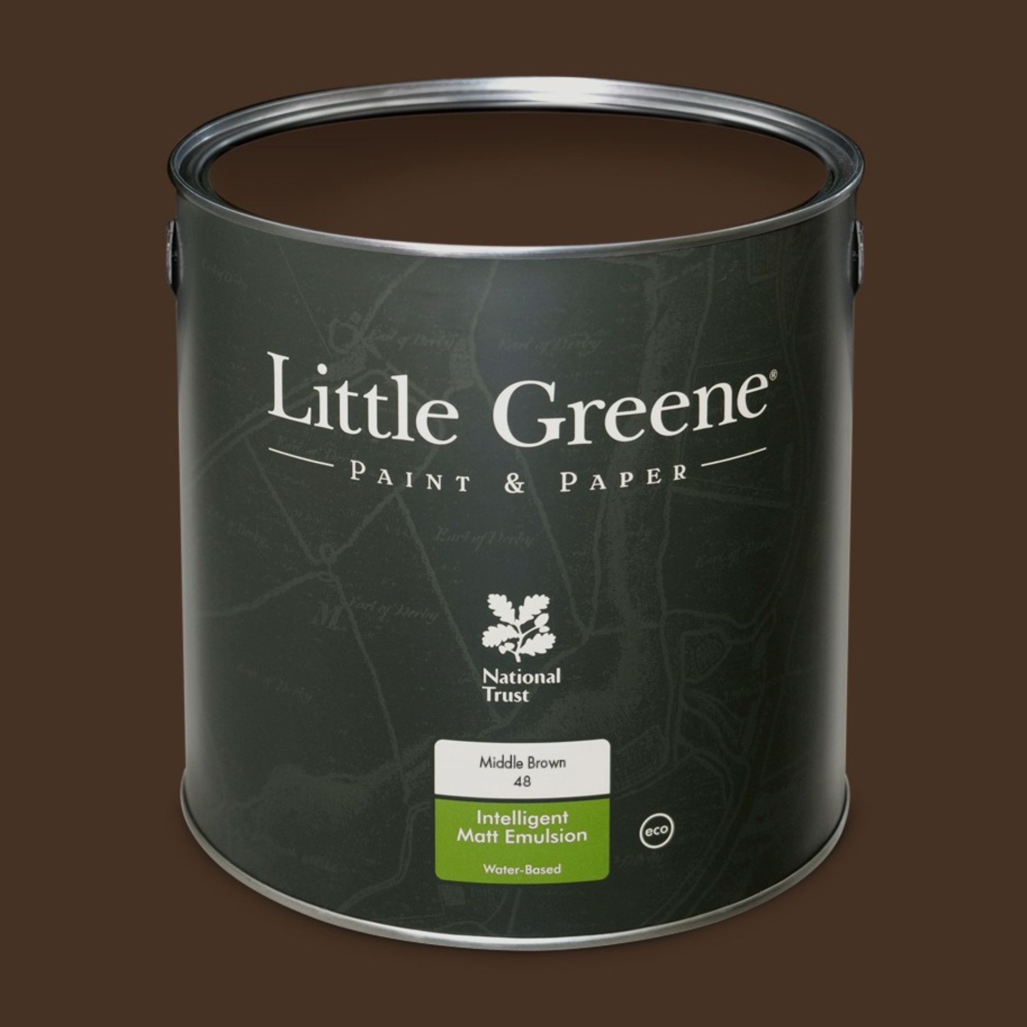
RRP: £57.50 | If you're looking for a slightly darker shade then this one from Little Greene is perfect. The brand recommend this luxurious shade to be used in living rooms due to its warming and inviting nature.
What is the best colour for a living room?
The best living room colour combination will very much depend on your personal preference, although there are trending colour palettes to help guide your decision-making. Our living rooms are typically the most social and frequently-used spaces in our homes, so it's important they have the right balance of showcasing personality but also being a restful place to unwind.
Tobie Lewis, Senior Brand Manager at Valspar Paint, says: "Choosing a colour that represents your interior style and is best suited for all occasions can be challenging, therefore prioritising a theme, such as neutral or retro colour trends, will help you be more selective.
"Neutral shades have recently been through a moment of reappreciation, with their trusty, versatile, calming, and Scandinavian nature. Shades such as Valspar’s Biscuit Crumbs and Tidy White are perfect for a neutral living room theme, for both layering with hessian and earthy textiles and contrasting with other non-neutral tones.
"If you want to add a hint of colour but keep the understated nature of a neutral theme in your living room, soft green tones are great for incorporating a sense of freshness into more organic palettes.
"If you want to explore more colourful themes in your living room, retro and 70s-inspired shades such as mustard yellows, peaches, and deep purples are a great place to start. Valspar’s Ochre Mountain, Moroccan Resort, Virtuoso, and Speckled Eggs are examples of colours that work amazingly together for a more adventurous, fun palette that celebrates the social nature of living rooms, whilst adding a sense of luxury for those more quiet moments.”

Tamara is a highly experienced homes and interiors journalist with a career spanning over 23 years. Now the Lifestyle Editor of womanandhome.com, she previously spent 19 years working with the style teams at Country Homes & Interiors and Ideal Home. With these award-winning interior teams, she gained a wealth of knowledge and honed her skills and passion for styling and writing about every aspect of lifestyle and interiors.
A true homes and interiors expert, Tamara has been an ambassador for leading interior brands on multiple occasions, including appearing on Matalan’s The Show and presenting at top interior trend forecasting events such as the Autumn Fair and Spring Fair.
- Lisa FazzaniHomes and interiors journalist