What is the Pantone Color of the Year 2022 and how to decorate your home with it?
The Pantone Color of the Year 2022 has been announced—here's what you need to know about the shade that 'encourages courageous creativity and imaginative expression'

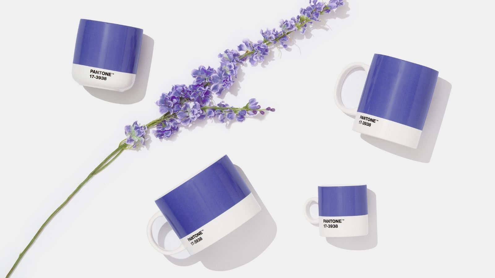
The Pantone Color of the Year 2022 has been announced and this year's brand new shade does not disappoint.
Pantone's Color of the Year is somewhat of a special occasion, with the color experts dictating interior paint color trends for the year ahead. The popularity of sage green is no accident, nor is the rise and rise of the color gray ('Ultimate Gray' was Pantone's Color of the Year last year).
This year, the Pantone Color of the Year 2022 is a brand new shade - the first time in the history of the yearly trend forecast this has happened.
Article continues below"The Pantone Color of the Year reflects what is taking place in our global culture, expressing what people are looking for that color can hope to answer,” said Laurie Pressman, Vice President of the Pantone Color Institute. “Creating a new color for the first time in the history of our Pantone Color of the Year educational color program reflects the global innovation and transformation taking place."
What is the Pantone Color of the Year 2022?
Pantone 17-3938 Very Peri has been revealed as the 2022 Color of the Year, a periwinkle blue that is said to symbolize optimism and change.
Described by Pantone as a "dynamic periwinkle blue hue with a vivifying violet-red undertone", Very Peri is a hopeful shade that encapsulates the transitional times we are currently living through. Merging realism and escapism through a whimsical shade that will bring a vibrant newness to home interiors, Very Peri will also influence fashion, beauty, and design with everything from the shades in your wardrobe to hair color trends.
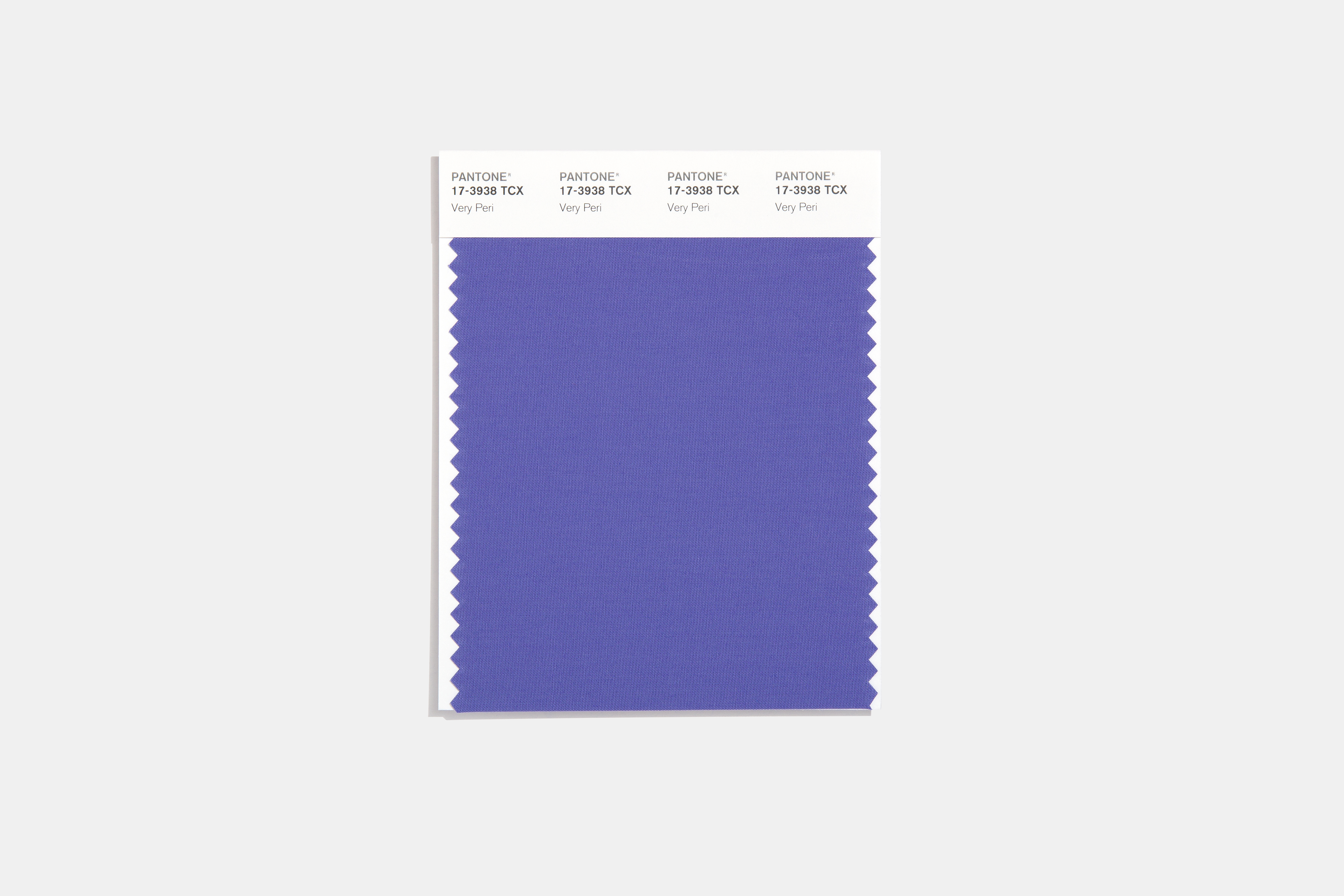
“As we move into a world of unprecedented change, the selection of PANTONE 17-3938 Very Peri brings a novel perspective and vision of the trusted and beloved blue color family,” says Leatrice Eiseman, Executive Director, Pantone Color Institute, in a press release.
Sign up to our free daily email for the latest royal and entertainment news, interesting opinion, expert advice on styling and beauty trends, and no-nonsense guides to the health and wellness questions you want answered.
“Encompassing the qualities of the blues, yet at the same time possessing a violet-red undertone, PANTONE 17-3938 Very Peri displays a spritely, joyous attitude and dynamic presence that encourages courageous creativity and imaginative expression.”
What colors go with Very Peri?
Do you love the carefree confidence of Very Peri but don't feel like drenching your entire space in the lavender tone? Below, experts advise on the colors that will complement Pantone's Color of the Year 2022.
1. Sage green
Sage green has proved an extremely popular shade over recent years—whether through trending fashion, Drew Barrymore's best-selling cookware, or on the walls of our homes—so it's no surprise that experts recommend pairing the hue with Very Peri.
"A soft and muted sage green will allow Very Peri to be the hero color," says Steph Briggs, Interior Designer & Co-Founder of La Di Da Interiors. "Combine with lashings of neutral tones including taupe, dirty cream, and linen for a calming palette."
2. Yellow
A hint of yellow will allow the lavender tones of Very Peri to pop. Consider a lively sunshine shade or mustard yellow tone that will add to the warmth and optimism of the space.
“Over the summer we have seen lilac becoming an extremely popular color choice in both fashion and interiors so it comes as no surprise that this color palette is taking over the next year. The best colors to pair with Very Peri include gold and mustard, as yellow is the true complementary color [on the color wheel]," says Emmie Brookman, Interior Design Expert and Creative Director of Silver Mushroom.
While yellow may be too bold of a choice for some people, Emmie has suggested alternative hues for those who'd prefer a more muted color.
"A safer option would be to match similar toned blues and pinks keeping within the same cooling shades of Very Peri," she explains. "Alternatively, this cool purple shade also looks beautiful with a stone gray - it all depends on the aesthetic you’re trying to achieve!”
3. Earth tones
Very Peri leans into nature, with the lavender tone often found in the great outdoors, so it makes sense to stick with neutral, earth tones.
"Pair Pantone's Color of the Year 2022 with neutral, earthy tones with lots of natural wood, to create a haven in the home," suggests Sasha York, Designer at Grain and Frame. "Whether it's exposed floorboards, solid oak furniture, or wood accessories and furnishings, using natural wood introduces a sense of warmth and character into any design scheme, and complements the purple hues found in Very Peri."
4. Blue
Sticking with similar tones, blue hues are the perfect pick for Pantone's Very Peri and prove enduring popular (Hague Blue was the most popular Farrow & Ball paint color of 2021).
Will Thompson, Head Of Product Marketing at Valspar Paint says: "Pantone’s Color of the Year is all about evoking the courage to go headfirst into transitional phases, which couldn’t be more apt for the current moment. Using such a vibrant tone can seem daunting, so complementing the bright violet with equally positive yet warming blue tones such as Valspar’s Frosted Blueberry and Flannel Grey, can make the color more cooling in a room."
Easy ways to decorate your home with Pantone's Color of the Year 2022
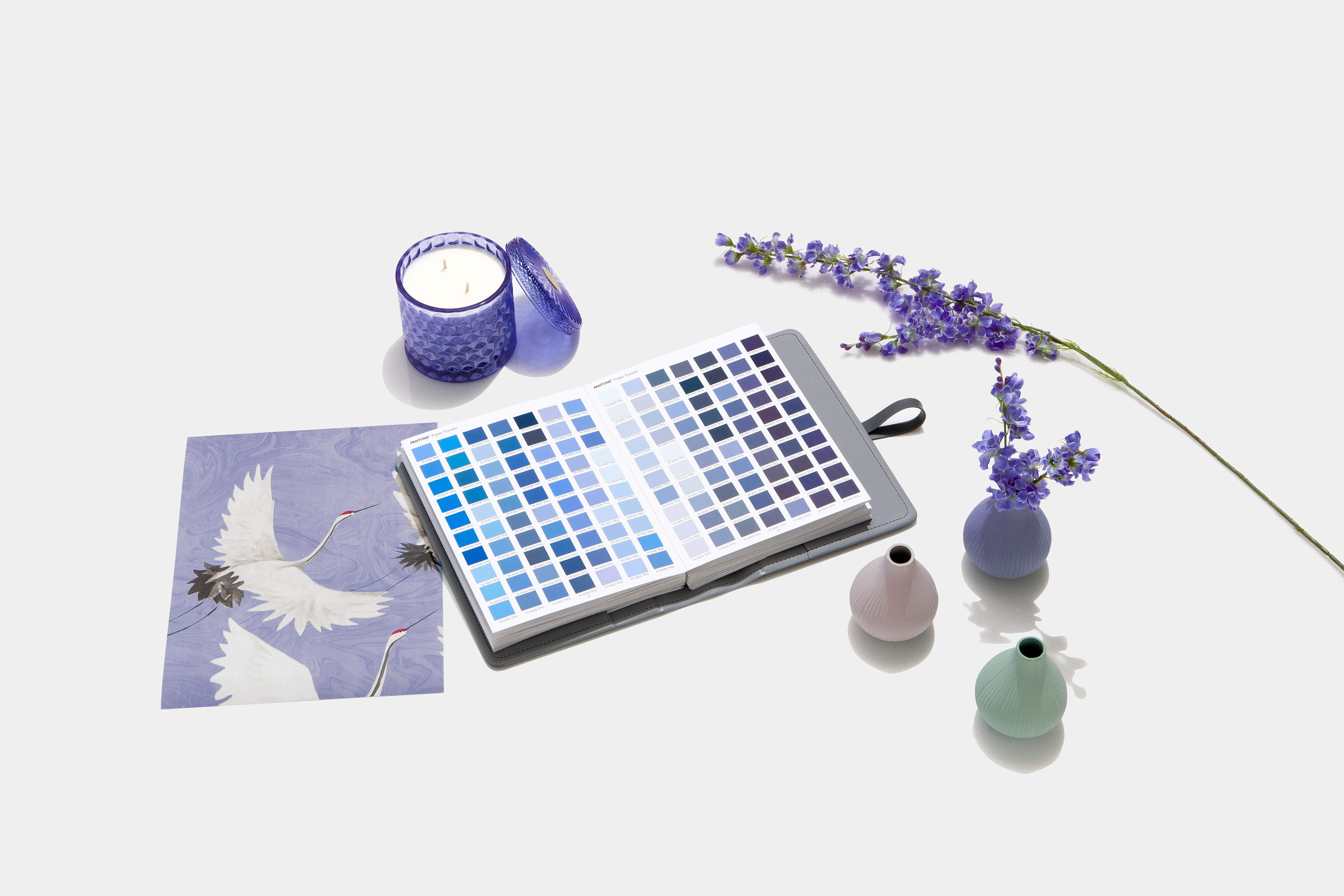
Pantone recommends using Very Peri as a bold symbol of self expression, experimentation, and daring imagination. From fashion pieces to beauty and home decor, Pantone's Color Institute says that the shade will make a "novel statement".
If you'd like to inject this playful hue into your space, discover some of our favorite pieces inspired by the Pantone 2022 Color of the Year below.
1. Duvet cover
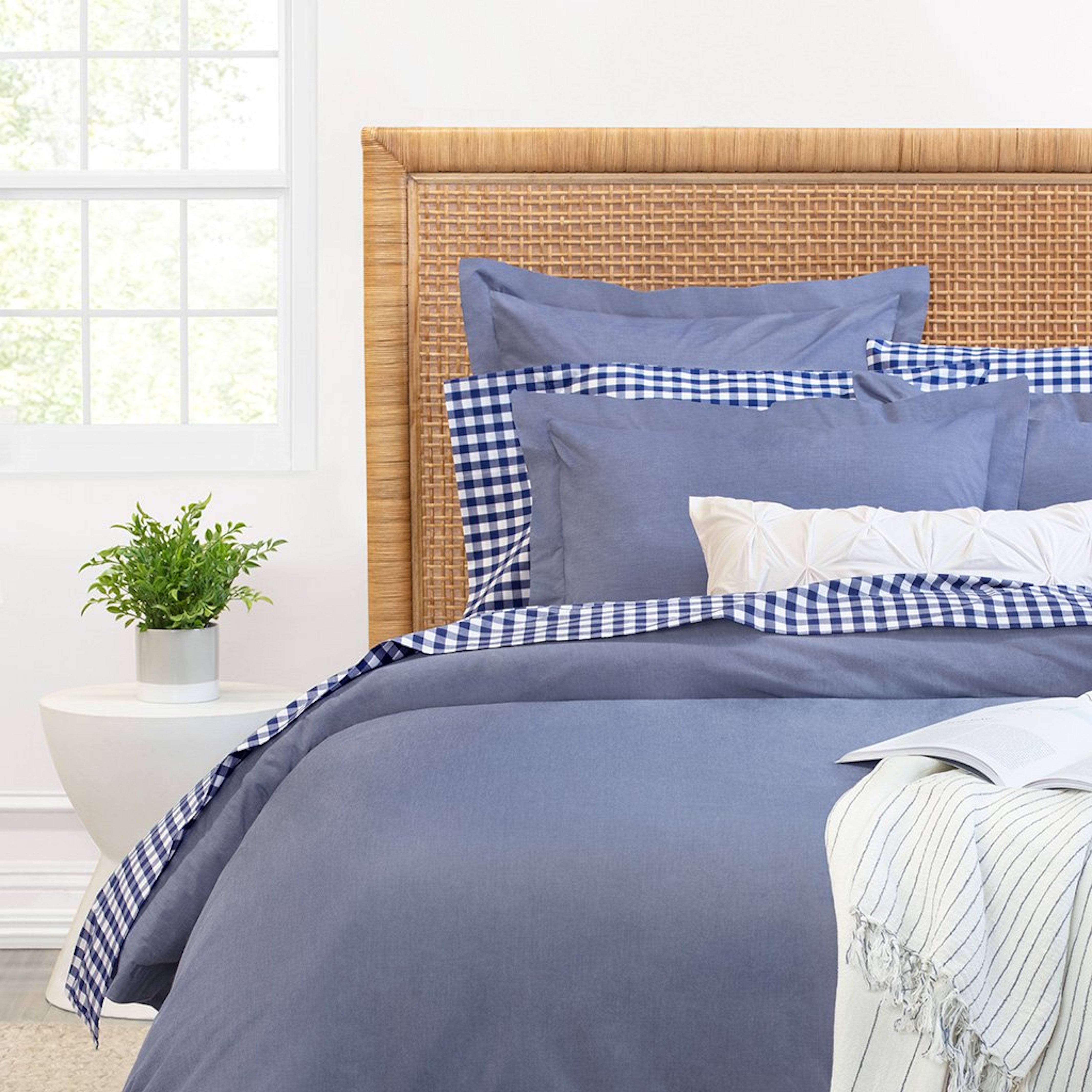
Add a touch of color to your sleep space with a blue-purple-toned duvet cover, keeping your space fresh while maintaining peaceful, neutral tones that will help you wind down.
US: Rae Blue Chambray Duvet Cover at Crane & Canopy for $149-$199
UK: Piglet In The Bed Linen Duvet Cover for £170
2. Wall Clock
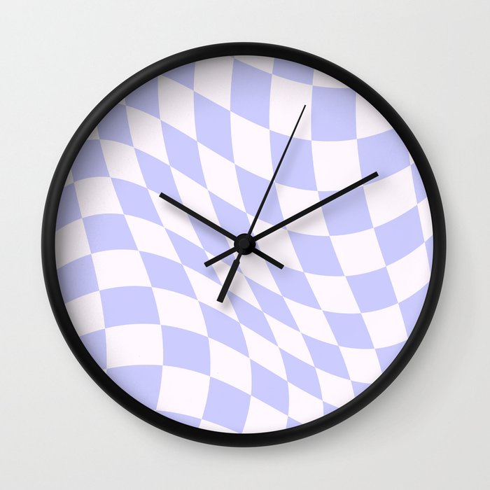
This trippy clock will add a playful touch to any room. With a warped checked print in an on-trend periwinkle hue, this statement piece is one way to rethink how you tell the time.
Warped Check - Periwinkle Wall Clock at Society6 for $27.30.
Or see this less-patterned clock by Georg Jensen for £195.
3. Tablecloth
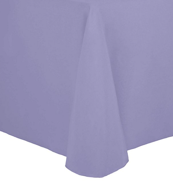
Dress up your table for your next occasion with this lilac tablecloth—the perfect way to temporarily incorporate the purple shade into your space.
US: 70-Inch x 104-Inch Oval Spun Polyester Tablecloth in Lilac at Bed Bath & Beyond for $64.99
UK: Washed linen tablecloth from H&M for £39.99
4. Throw pillow
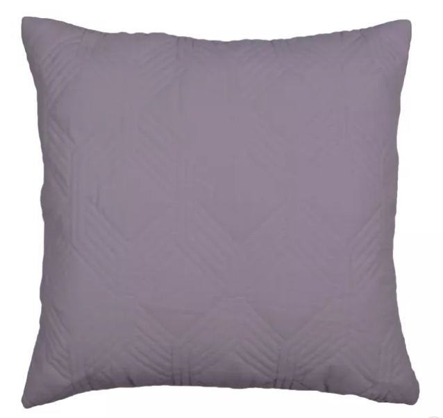
Keep your living space super cozy with throw pillows. This purple pillow from Target will add a hint of color to your couch without being too bright and bold. Layer them up for the ultimate comfort level.
US: 18"x18" Matcha Quilted Velvet Square Throw Pillow at Target for $21.59.
UK: Shop purple cushions on Etsy.
5. Rug
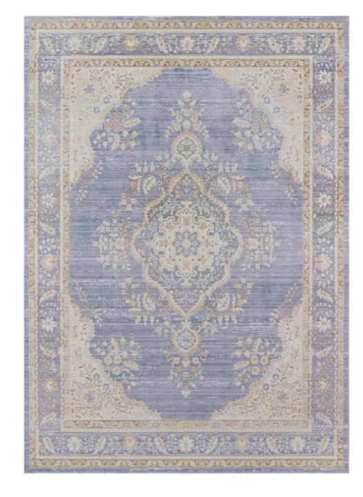
Add depth and texture to any space with this vintage-style surface rug. Featuring a classic design in a modern periwinkle shade, it's the perfect mix of old and new.
US: Isabella Charli Medallion Loomed Accent Rug at Target for $259.99
After watching 13 Going on 30 one too many times, Emma decided that she wanted to be a journalist and studied Multimedia Journalism at the University of Salford. She started her career as a fashion copywriter before delving into the world of digital journalism and her published work can be found in the likes of woman&home, Cosmopolitan, Metro, i-D and Apartment Therapy. Emma writes about interior design, travel, film and television, celebrities, and internet culture.

