Pantone reveals new colour to quash stigma around menstruation


Pantone has revealed a new colour in an attempt to quash the stigma around menstruation.
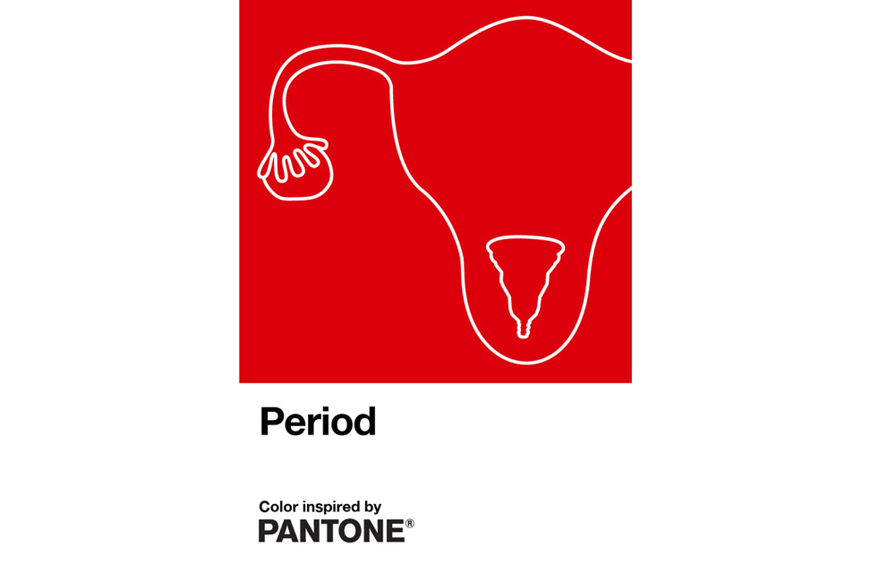
The Pantone Color Institute has partnered with intimate healthcare brand INTIMINA to release a custom colour that is emblematic of menstruation.
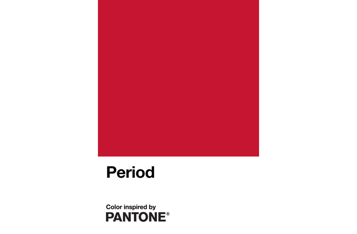
Named Period, the new colour is an original shade of red that represents a woman's period and has been formed as part of INTIMINA’s global Seen+Heard campaign, which aims to quash the stigma around menstruation.
Speaking about the new colour, Laurie Pressman, Vice-President of the Pantone Color Institute, said, “We were very honoured to partner with Intimina on the creation of Period, a confident red shade symbolic of the empowering message expressed in their new Seen + Heard campaign.”

Describing the new shade, Laurie added, “An active and adventurous red hue, courageous Period emboldens people who menstruate to feel proud of who they are. To own their period with self-assurance; to stand up and passionately celebrate the exciting and powerful life force they are born with; to urge everyone regardless of gender to feel comfortable to talk spontaneously and openly about this pure and natural bodily function.”
Danela Žagar, Global Brand Manager at Intimina, also spoke about the special partnership, saying, “Despite the fact that billions of people experience menstruation, it has historically been treated as something that shouldn’t be seen or talked about publicly. And if we look at popular culture, depictions of periods have ranged from wildly inaccurate and unsympathetic to being the subject of jokes and derision.

“Enough is enough, it’s 2020. Isn’t it time periods stop being considered as a private affair or a negative experience? Isn’t it time we call out people that try to perpetuate the stigma surrounding periods? Or those that mock it? Isn’t it time we come together to encourage period positivity and make sure periods are seen and heard?
Sign up to our free daily email for the latest royal and entertainment news, interesting opinion, expert advice on styling and beauty trends, and no-nonsense guides to the health and wellness questions you want answered.
“That’s what we aim to do with our campaign and it’s been brilliant to have The Pantone Color Institute lend their support as we launch it by creating an original red colour emblematic of a steady flow during menstruation. Pantone’s ‘Period’ red shade represents exactly what our Seen+Heard campaign is about: making periods visible, encouraging positive conversations and normalising menstruation in our culture, our society and in our everyday lives.”

Aleesha is Beauty eComm Editor at woman&home, where she gets to share her expertise into all the best techniques, sharpest tools and newest products—with a particular savvy in skincare and fragrance.
Previously, she was Deputy Editor and Beauty & Fashion Editor for My Imperfect Life, where she headed up the beauty, fashion and eCommerce pages. In the past, she has contributed to a number of women's lifestyle publications, including Women's Health and Stylist, and has earned an MA in Magazine Journalism from City, University of London and an AOP awards nomination for her past work on woman&home's news team.