5 rules of thumb for mixing wood tones around your home, shared by interior designers
Professionals reveal their secrets for mixing wood tones in interior design

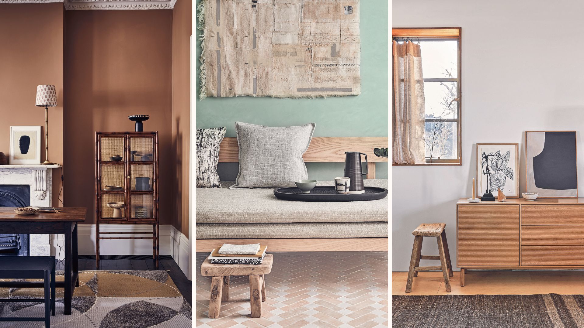
Mixing wooden furniture of different tones can be tricky, as it's hard to make sure everything 'goes' together. On the one hand, you don't want things to feel disjointed or mismatched, but neither do you want lots of very similar but not quite matching wood tones sitting side by side.
It's a design dilemma we've all faced at some stage as 99% of us don't purchase all our furniture at once but collect pieces gradually over time. And it's those items we have inherited, bought second-hand, and even found in the street, that make a house a home.
It pays to know how to mix wood tones at home as it can in fact make your home look more expensive. Experts will tell you that mixing woods can actually make your home look more 'designed' and stylish.
Article continues below"Mixing wood tones in your home is a great way to add interest and create a more designed look," says interior designer Sophie Clemson. "If everything's the same type of wood, it can look flat and uninteresting."
How to mix woods in interiors
The wood finishes don't need to match, but there are a few rules of thumb that will help no end when mixing woods to give your home personality. Below, interior designers share how to make it all work together.
1. Choose complementary tones
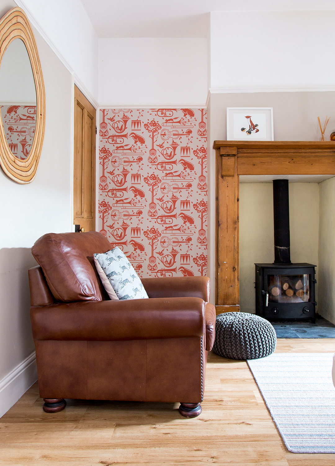
Some woods will, of course, work better together than others. As a rule of thumb, walnut and oak mix well together since the darker tone of walnut adds depth and contrast to oak. Walnut and maple will also pair together nicely – it's all about the tone of the wood, as interior designer Courtney Cole from TileCloud explains:
"Woods with complementary colours can create a cohesive look, which is what I usually recommend. The complementary tones between walnut (dark, rich tones) and maple (light, soft tones) make them work really well together." What you don't want are clashing undertones, like a pale grey floor with a warm oak dining table which will jar because of the mix of cool and warm undertones.
Sign up to our free daily email for the latest royal and entertainment news, interesting opinion, expert advice on styling and beauty trends, and no-nonsense guides to the health and wellness questions you want answered.
A quick fix for this is to add an area rug underneath the table to break it up. When choosing a rug, look for patterns that combine cool and warm tones, like this blue and beige patterned rug from Ruggable. This will act as a buffer and make the space feel different, making it a nice way to update your home for the new season.

Courtney Cole is an interior designer at the Australian kitchen and bathroom company TileCloud, which manufactures and distributes tiles, hardware, and other renovation necessities. Courtney has been working in interior design for a several years, and has heaps of experience in home design.
2. Use the 60-30-10 rule
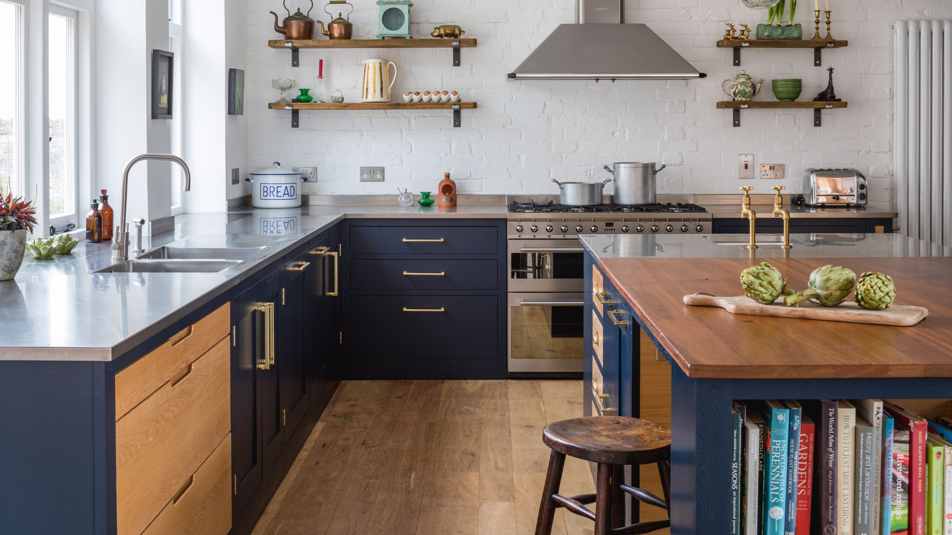
"If you’re unsure of how many wood tones you should mix, use the 60-30-10 colour rule, but for wood tones instead," suggests Sophie Clemson. According to the classic decor rule, you should have three main colours in your palette and aim to have 60% of the room in your main, dominant colour, 30% of the space in a secondary colour, and then an accent colour taking up the last 10%.
If you already have lots of oak, that can be your 60%, then consider adding some pine and a touch of charcoal or white wood. "Try to use the same wood tone a few times within the room to create a flow and a cohesive look," Sophie says.
"This doesn’t have to be with large pieces of furniture, it could be with lighting, such as a table lamp base, the arm and legs on an accent armchair, or a curtain pole, for example."

Sophie Clemson is the co-founder of The Living House, an affordable online interior design company that helps busy families transform their homes easily, online and within their budget.
3. Be consistent with other design elements
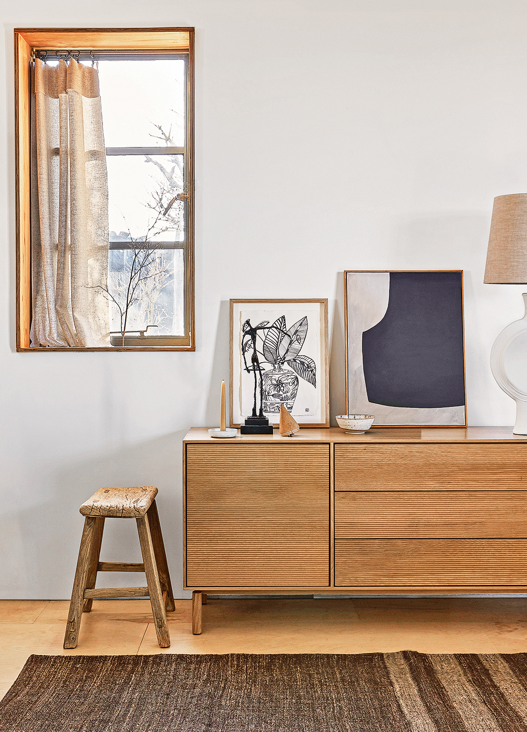
It's always helpful to bear in mind the main elements of interior design, which are space, shape, line, colour, texture, light and pattern. When mixing wood tones, we're dealing with colour (and pattern, if we consider the kind of grain).
One way to ensure your different wood tones match is to be consistent with other design elements. For example, you might choose to have all of your furniture in a similar style, be it traditional, contemporary or Scandi, or opt for pieces with organic, curved shapes where possible.
"This will help create a consistency between the other elements of design that will pull attention away from wood types that might not work well together generally," says interior designer Courtney Cole. "I also recommend using a unifying colour in your decor, like with cushions, throws, or other decorative pieces, to help tie in the different tones of wood in the space."
Courtney's final pro tip is to add various textures through fabrics, rugs, and accessories that call out to each other through the space and help blend different wood tones and make the overall look more cohesive.
4. Incorporate black wood
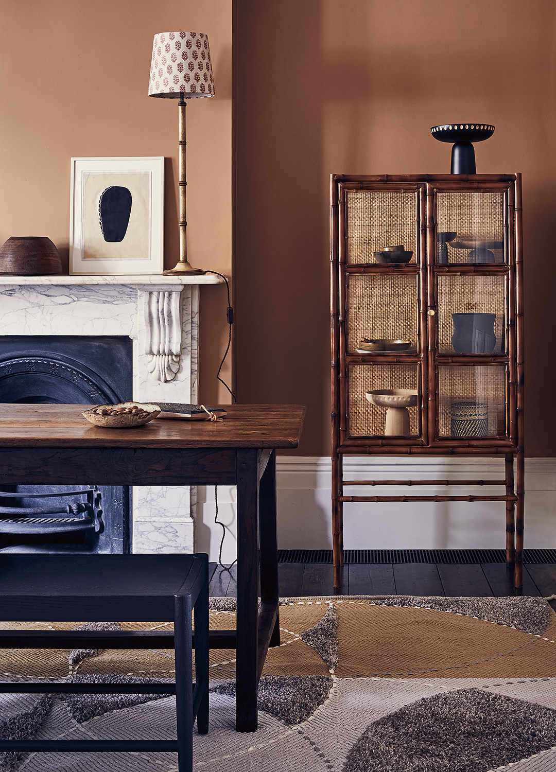
Contrast is key when using different woods in one space, and having some black tones can really help to break things up. Sophie Clemson points out that black wood means you can keep wood textures in the room, with the aesthetically pleasing wood grain, while introducing black, which always anchors a room.
As Mad About The House interiors writer Kate Watson-Smyth often says, every room needs "something new, something old, something black and something gold," so make sure you have some black elements in the mix.
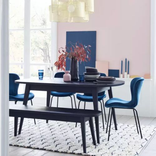
RRP: £550 | This table has a compact design that can be extended out to seat eight people. It has a rounded edge and veneered top, with tapered legs in solid oak. Its saturated stain accentuates the design's strong silhouette without obscuring its grain. Exclusive to Habitat and also available in natural oak.
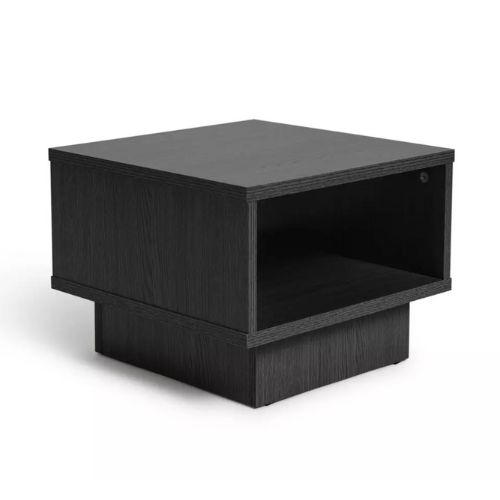
RRP: £24 | This cube-shaped end table has an open design, creating an airy and spacious look ideal for smaller spaces. Handy for the end of the sofa or next to an armchair, it can hold books and magazines, with a surface for coasters, lamps and candles. It's an inexpensive and functional item with hundreds of positive online reviews, currently available at 20% off.
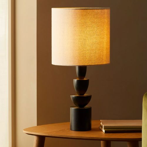
RRP: £125 | This table lamp has a wooden base stained in black, with the visible wood grain creating a lovely texture. The unusual shape gives it a striking silhouette, combining a mid-century look wit ha more modern vibe. It has inlays of matte, brass toned metalwork and a linen fabric shade.
5. Avoid having one wood tone singled out
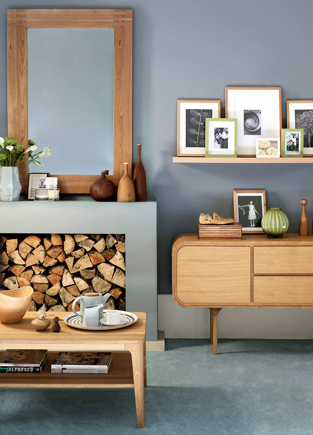
A mixture of tones can look great when there is a balance between light and dark. For instance, if you have dark wooden flooring, you could opt for some pale wooden furniture to create contrast.
"Just make sure that whichever wood tone you introduce isn't singled out and is presented again in other matching furniture which will give the room harmony," says Courtney.
Interior designer Alice Moszczynski at Planner 5D shares a final tip, which is to aim for a mix of light, medium, and dark wood tones to create contrast and balance. "For example, pair medium-toned maple cabinets with lighter pine accents. They shouldn’t look too similar, otherwise they get muddy."
FAQs
Which wood works well with oak?
"Oak, which has a warm tone and an interesting grain, will work well with woods like walnut, cherry, and even lighter woods like birch or maple," says Courtney Cole. "Its more neutral undertone makes it a good choice to support other tones while still having its own charm."
It's also a good idea to think about the type of wood grain as large knots in wooden surfaces can act a bit like a pattern and create a more country farmhouse feel, in contrast with the more uniform lines of some wooden flooring, or the more detailed pattern of a burled wood coffee table or desk.

Millie Hurst is a freelance writer and interior designer based in Sheffield, helping clients create homes that are characterful, curated, and highly functional. Interior design inspirations include Jake Arnold, Beata Heuman and Abigail Ahern. Her personal style is a 'liveable maximalism' with boho, nature-inspired designs.
She has seven years of experience in the world of digital journalism, most recently working as Head of Solved at Homes & Gardens, where she wrote and edited countless features on home organisation, decluttering and interior design. Before that, she was Senior Content Editor at Ideal Home.